 PivotTables in Excel are one of the most powerful tools for analysing and summarising large datasets, without requiring complex formulas. Whether you’re working with sales figures, expense reports, or survey responses, PivotTables help you uncover trends and patterns quickly. In this Excel pivot table tutorial, we’ll walk you through preparing your data, creating your first PivotTable, customising it, and using it effectively—step by step.
What is a Pivot Table and Why Use It?
A PivotTable is an Excel feature that summarises and groups data, allowing you to calculate totals, averages, and other metrics effortlessly. Instead of manually sorting and filtering, a PivotTable does the heavy lifting for you.
Common uses include:
- Summarising sales by region or product
- Analysing expenses by category
- Breaking down survey responses by demographics
If you’re new to Excel data analysis, PivotTables provide a faster, more intuitive way to make sense of your data.
Preparing Your Data for Pivot Tables
Before creating a PivotTable, your data must be properly structured. Otherwise, you may encounter errors or incorrect summaries. Follow these best practices to ensure smooth analysis:
1) Use a Clean, Tabular Format
- Headers in the first row: Each column should have a clear, unique name (e.g., “Sales,” “Region,” “Date”).
- No blank rows or columns: Gaps disrupt the PivotTable’s ability to read the full dataset.
- Avoid merged cells: These can cause referencing issues when generating summaries.
Example: If analysing sales data, your columns might include Product, Quantity Sold, Price, and Date, with each row representing a separate transaction.
2) Convert Your Data into an Excel Table (Ctrl + T)
- Why? Excel Tables automatically expand when new data is added, so your PivotTable stays up to date.
- How? Select any cell in your dataset, press Ctrl + T, and confirm the range includes headers.
- Bonus: Tables also enable structured references (e.g.,
Table1[Sales]), making formulas easier to read.
3) Ensure Consistent Data Types in Columns
- Numbers: Keep numerical data (e.g., prices, quantities) free from text or symbols.
- Dates: Format all dates uniformly (e.g., DD/MM/YYYY) — avoid mixing formats like “March 2024” and “15/03/2024”.
- Text vs. Numbers: A column like “Invoice Number” should either store numbers or text (e.g., “INV-1001”), not both.
- Common pitfall: If a “Revenue” column contains a few cells with “N/A” (text), Excel may ignore numerical values when summarising.
4) Remove Subtotals and Grand Totals
PivotTables calculate these automatically; pre-existing totals in your source data will lead to double counting.
Here’s an example of structured data: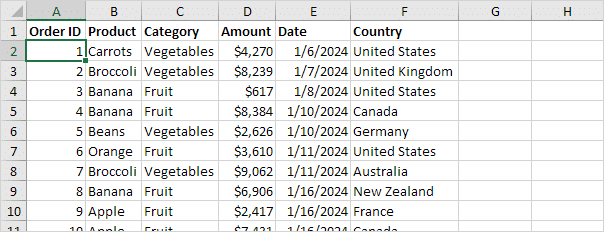
(Source: Excel Easy)
By following these steps, your data will be PivotTable-ready, ensuring accurate and efficient analysis. Next, let’s explore how to use Pivot Tables in Excel.
Creating Your First Pivot Table in Excel
Now that your data is properly prepared, let’s walk through the process of building your first Excel PivotTable, step by step.
Step 1: Insert a PivotTable
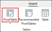
Where to find PivotTable Example
- Click any cell within your dataset (Excel automatically detects the range).
- Go to the Insert tab in the ribbon.
- Click PivotTable (or PivotTable → From Table/Range if using an Excel Table).
A dialog box will appear with two key options.
Step 2: Choose Where to Place Your PivotTable
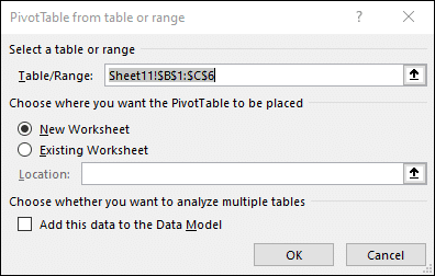
- New Worksheet (recommended for beginners) — Creates a fresh sheet, keeping your original data separate.
- Existing Worksheet — Lets you pick a location (e.g., next to your data). Click the Location field and select a cell.
Tip: For clarity, stick with a new worksheet—it prevents accidental overlaps with your source data.
Step 3: Use “Recommended PivotTables” for Quick Setup (Beginner-Friendly!)
- Go to Insert → Recommended PivotTables.
- Excel suggests layouts based on your data (e.g., “Sum of Sales by Product”).
- Click a preview to insert it, then tweak as needed.
Example: If your data has “Sales,” “Region,” and “Month” columns, Excel might propose a summary of total sales per region.
Step 4: Build Your PivotTable Manually
If you skip recommendations, Excel creates a blank PivotTable with:
- A blank grid on the worksheet.
- The PivotTable Fields pane (right side), where you drag and drop columns into Rows, Columns, Values, or Filters.
Try this: Drag “Product” to Rows and “Sales” to Values to see a sum of sales by product.
Important: Your Original Data Is Safe!
- PivotTables do not alter your source data—they only display summarised results.
- If you make a mistake, just delete the PivotTable and start over.
Practice Tip: Open a sample dataset (e.g., a sales log or survey responses) and test these steps. The more you click around, the faster you’ll learn!
Next up, let’s explore how to customise your PivotTable like a pro.
Understanding the PivotTable Field List
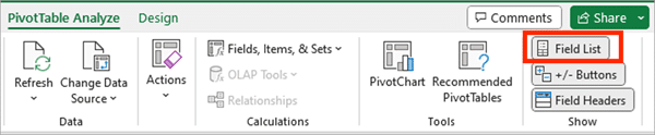
The PivotTable Field List is where you build your table by dragging fields into four key areas:
- Rows: Group data into categories (e.g., “Product” or “Region”).
- Columns: Split data horizontally (e.g., “Month” or “Quarter”).
- Values: Perform calculations (e.g., “Sum of Sales” or “Average Profit”).
- Filters: Apply dropdown filters to control displayed data (e.g., “Year”).
Example: To analyse the number of clicks per blog post:
Drag “Top Pages” to Rows:
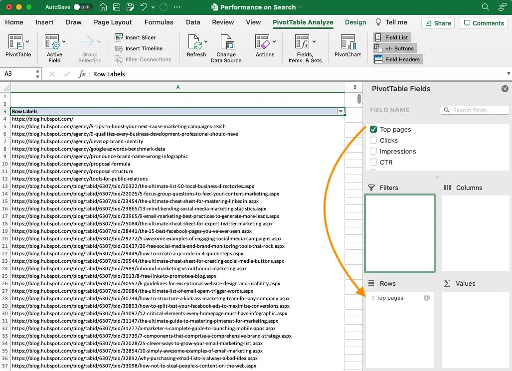
Drag “Clicks” to Values:
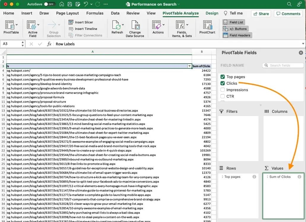
(Image Source: Hubspot)
This setup instantly shows total clicks for all blog posts.
Remember: The Field List is your playground. Don’t hesitate to drag fields between areas to see different perspectives of your data!
Next, learn to group dates, change calculations, and apply advanced sorting.
Customising and Analysing Your Pivot Table
Now that you’ve built your first PivotTable, let’s transform it from a simple summary into a powerful analytical tool. These customisation techniques will help you uncover deeper insights with just a few clicks.
1) Changing Value Calculations
Don’t settle for default sums. PivotTables offer multiple ways to interpret your data.
Right-click any value → Value Field Settings
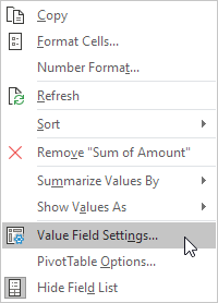
Choose from:
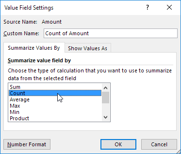
- Sum (default for numbers)
- Average (perfect for performance metrics)
- Count (great for survey responses)
- Max/Min (identify outliers)
- Standard Deviation (measure variability)
Pro Tip: For financial analysis, use “% of Column Total” to show contribution percentages.
Example: Change “Impressions” from Sum to Average to see the average number of impressions per blog post.

(Image Source: HubSpot)
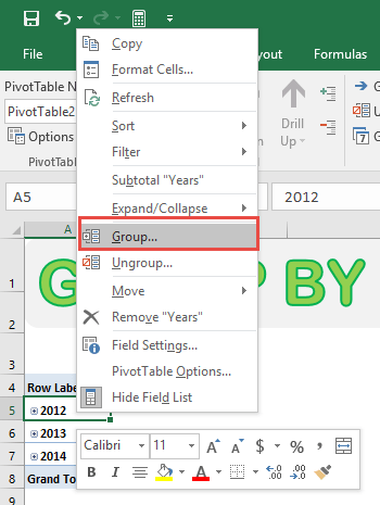
2) Grouping Dates for Smarter Time Analysis
Stop wrestling with daily data—group dates to spot trends:
- Right-click any date in your PivotTable
- Select Group
- Choose: Months/Quarters/Years (standard reporting), Days with a number (e.g., 7 for weekly), or custom start/end for fiscal years
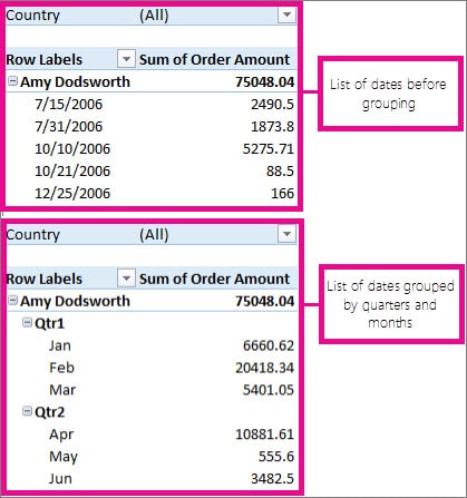
Group by Date and Time (Source: Microsoft)
Power User Trick: Combine grouping with conditional formatting to highlight seasonal patterns.
Example: Group order dates by Month and Year to track monthly sales growth.
3) Advanced Sorting and Filtering
Sorting:
- Click the dropdown arrow in any row/column header.
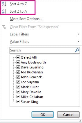
- Sort A→Z, Z→A, or by value (e.g., largest order amount first).
- Right-click → Sort → More Sort Options for custom rules.
Filtering
Use the dropdown in headers to:
- Select specific items (e.g., only Eastern region).
- Apply label filters (e.g., product names containing “Pro”).
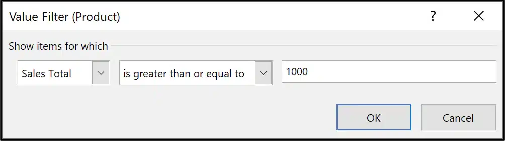
- Use Value Filters (e.g., sales > $1,000).
Hidden Gem: Right-click → Filter → Top 10 to instantly highlight best/worst performers.
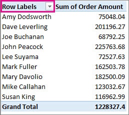
4) Practical Example: Monthly Sales Trends
Let’s analyse a year’s worth of daily sales data:
Step 1: Drag Order Date to Rows.
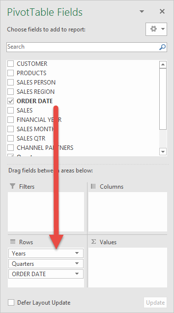
Step 2: Right-click → Group → select Months and Years.
Step 3: Drag Sales to Values.
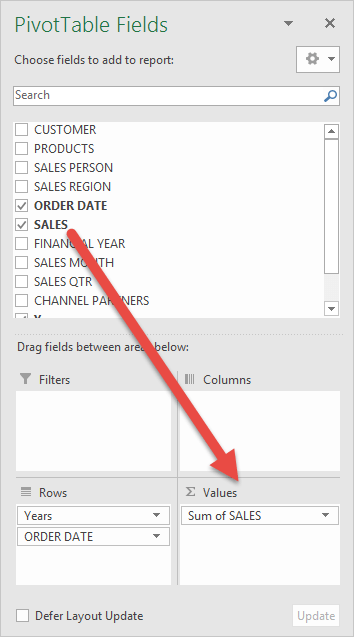
Step 4: Right-click Sales → Show Values As → % Difference From (previous month).
Step 5: Sort by sales descending to see peak months.
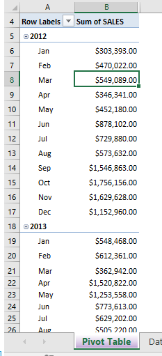
Total Sales for Each Monthly Period
This 30-second analysis reveals monthly growth rates and seasonal patterns!
Remember: The secret to powerful analysis is experimentation. Try different groupings, calculations, and filters to see what stories your data can tell!
Updating & Refreshing PivotTables
Keeping your PivotTables up-to-date is essential to ensure your analysis reflects the latest data. Here are three ways to refresh your reports:
1. Manual Refresh (Single PivotTable)
- Right-click anywhere inside the PivotTable
- Select Refresh (or press Alt + F5)
Best for: Quick updates when you’ve edited existing data.
2. Auto-Refresh with Excel Tables
If your source is an Excel Table (Ctrl + T):
- New rows added to the table will automatically be included when refreshed
- No need to adjust the data range
Pro Tip: Use tables for dynamic datasets (e.g., ongoing sales logs).
3. Refresh All (Multiple PivotTables)
- Go to Data → Refresh All (or press Alt + F5 + A)
- Updates every PivotTable in your workbook at once
Use when: You’ve modified source data used across multiple reports.
Pro Tips for Beginners
Here are a few tips to help you avoid common beginner frustrations when creating your first Pivot Table:
1. Start Simple
New users often overwhelm their PivotTables by adding every available field. Instead:
Do This: Begin with just 2–3 key fields:
- Rows: Product Category
- Values: Total Sales
Analyse one clear question at a time, such as “What are our top-selling products?”
Avoid This:
- Adding Region, Salesperson, Month, and Discount all at once
- Creating a complex matrix before understanding the basics
2. Use Clear Column Names
- Rename vague headers like “Column1” to “Region” or “Revenue.”
- Why? Makes field selection intuitive when building PivotTables.
- Bonus Tip: Use underscores instead of spaces (e.g., “Unit_Price”) to prevent formula errors later.
3. Practice with Sample Data
Download free datasets such as:
Try summarising monthly expenses or survey responses.
Common Pivot Table Mistakes to Avoid
Even Excel pros occasionally stumble into these traps—think of them as “PivotTable potholes” that can derail your analysis. Here’s how to steer clear:
1. Mixed Data Types
When your “Revenue” column contains both numbers ($1,250) and text (“N/A”), Excel gets confused and may:
- Default to counting instead of summing
- Exclude numeric values from calculations
- Show misleading averages
The Fix:
- Clean data first using Text to Columns or Find/Replace
- Use
IFERROR()for formula-generated data - Apply consistent formatting (e.g., all currency)
2. Forgetting to Refresh
Imagine presenting quarterly results where:
- Your PivotTable shows old numbers
- Your manager has the updated spreadsheet
- You’re left explaining why the data doesn’t match
Prevention Routine:
- Always refresh before sending reports, presenting findings, or making decisions
- Set a visual reminder (e.g., coloured cell with “LAST REFRESHED: [date]”)
Pro Tip: Use Power Query for auto-refreshing connections to databases.
3. Overloading Fields
Symptoms of an overloaded PivotTable:
- Slow response when dragging fields
- “Not Responding” messages
- Colleagues squinting at an overwhelming grid
The Cure:
Follow the 5-3-2 Rule:
- 5 or fewer row fields
- 3 or fewer column fields
- 2 or fewer value calculations
Use Slicers for interactive filtering instead of adding more row/column fields.
Wrapping Up
Mastering how to use PivotTables in Excel simplifies data analysis, saving time and effort.
From this article, you’ve learned to:
1. Prepare Data Like A Pro
- Clean tables with clear headers
- Consistent formatting
- No blank rows/columns
2. Build Insightful Reports
- Drag-and-drop simplicity
- Smart grouping (dates, categories)
- Custom calculations
3. Maintain Accuracy
- Regular refreshing
- Excel Table best practices
- Avoiding performance killers
By preparing your data correctly, structuring your PivotTable, and customising it with filters and charts, you can turn raw numbers into meaningful insights.
Next Steps:
- Practice daily with different datasets
- Explore sorting/filtering variations
- Try creating a PivotChart as your first advanced step
The best way to learn is by doing – open Excel now and pivot some data!
Ready to Dive Deeper?
Master PivotTables and beyond with @ASK Training’s hands-on Microsoft Excel courses, equipping you with real-world techniques you can apply immediately at work.
Here are a few recommended Excel courses you can start with:
- Introduction to Microsoft Excel Power Query, Data Model, Power Pivot & DAX
- WSQ Microsoft Excel Intermediate Course
- WSQ Microsoft Excel Advanced Course
- Advanced Pivot Table Techniques in Microsoft Excel
Get in touch with us and find your perfect Excel course today!