Every Excel user reaches a point where standard formulas and pivot tables simply aren’t enough.
When you find yourself wrestling with complex calculations across multiple tables or struggling to analyse years of data efficiently, that’s when DAX (Data Analysis Expressions) in Power Pivot becomes essential knowledge.
This guide will walk you through Power Pivot, DAX functions such as measures and calculated columns, with practical examples to help you work more efficiently with large datasets.
Let’s begin by understanding exactly what Power Pivot and DAX are, and how they work together to solve complex data challenges.
What Are Power Pivot and DAX?
Power Pivot is Microsoft’s advanced data modelling tool built directly into Excel, designed specifically for working with large and complex datasets.
Unlike standard Excel worksheets, Power Pivot can efficiently handle millions of rows of data from multiple sources while maintaining fast calculation performance.
It serves as a powerful data engine that allows you to:
- Import and combine data from various sources (SQL databases, Excel files, web data)
- Create relationships between different data tables
- Build comprehensive data models without requiring external BI tool
- Process significantly larger datasets than traditional Excel can manage
DAX (Data Analysis Expressions) is the specialised formula language that brings Power Pivot’s capabilities to life.
While it shares some similarities with regular Excel formulas, DAX is specifically optimised for:
- Working with relational data across connected tables
- Creating dynamic calculations that respond to report filters
- Performing complex aggregations and time-based analysis
- Developing measures that automatically adjust based on context
For users familiar with advanced Excel formulas, the transition to DAX will feel natural yet more powerful.
Where a standard Excel formula might calculate values within a single table, DAX can seamlessly pull information from related tables and perform calculations across entire data models.
For example, while Excel would require complex VLOOKUPs to combine data from different tables, DAX can reference related tables directly through established relationships.
Think of it this way: If Excel formulas are like giving directions street-by-street, DAX is like having a GPS that automatically adjusts your route when conditions change.
Now that you see how Power Pivot and DAX work together, let’s explore why these tools solve problems that frustrate many Excel users.
Why Use DAX Instead of Regular Excel Formulas?
While Excel formulas work well for basic calculations, they hit significant limitations when working with complex business data. Let’s examine these challenges and how DAX provides better solutions.
The Limitations of Regular Excel Formulas
- Struggles with Large Datasets
- Excel workbooks slow down or crash with 100,000+ rows
- Formulas recalculate the entire sheet, wasting resources
- Example: A SUMIFS across 500,000 transactions bogs down your workbook
- Poor Handling of Table Relationships
- Requires complex VLOOKUPs or INDEX/MATCH between tables
- Relationships break when data structure changes
- Example: Tracking inventory across warehouses requires manual table merging
- Static Calculations
- Formulas don’t automatically adjust to filters or slicers
- Time-based comparisons need manual formula updates
- Example: “Q3 2023 vs Q3 2022” requires rewriting formulas each period
How DAX Solves These Problems
- Time Intelligence Example: Year-over-Year Comparison
Standard Excel Approach:
=IF(AND(YEAR(A2)=2023,MONTH(A2)<=9),SUMIFS(Sales,Date,">1/1/2023",Date,"<=9/30/2023"),

IF(AND(YEAR(A2)=2022,MONTH(A2)<=9),SUMIFS(Sales,Date,">1/1/2022",Date,"<=9/30/2022"),""))
DAX Solution:
YoY Sales Growth =

VAR CurrentSales = TOTALYTD(SUM(Sales[Amount]), 'Date'[Date])

VAR PriorSales = TOTALYTD(SUM(Sales[Amount]), SAMEPERIODLASTYEAR('Date'[Date]))

RETURN

DIVIDE((CurrentSales - PriorSales), PriorSales)
Advantages:
- Automatically updates when new data arrives
- Works with any date filter selection
- Calculates across entire dataset efficiently
- Dynamic Ratio Calculations
Need to track “Profit Margin by Product Category”?
Standard Excel:
- Requires helper columns
- Manual category filtering
- Breaks when new categories added
DAX Measure:
Profit Margin =

DIVIDE(

SUM(Sales[Profit]),

SUM(Sales[Revenue]),

0

)
Here’s a simple before and after:
BEFORE (Excel):
=SUMIFS(ProfitRange,CategoryRange,"Electronics")/SUMIFS(SalesRange,CategoryRange,"Electronics")
AFTER (DAX):
Profit Margin = DIVIDE(SUM(Sales[Profit]), SUM(Sales[Revenue]))
- Cross-Table Analysis
Calculating “Average Customer Spend by Region”:
Standard Excel:
- Requires merging customer and sales data
- Complex array formulas
- Manual refresh needed
DAX Measure:
Avg Spend by Region =

AVERAGEX(

Customers,

CALCULATE(SUM(Sales[Amount]))

)
Maintains:
- Live connection between tables
- Correct averages at any grouping level
- Optimal performance with large datasets
Real-World Impact: Excel vs. DAX Comparison
| Business Need | Excel Approach | DAX Solution |
| Quarterly performance comparison |
Manual pivot tables per quarter + separate formulas |
Single measure: Sales QoQ = QUARTERLYGROWTH(...) |
| Year-over-year product analysis |
12+ column helper formulas + manual year filters |
One measure: YoY Change = SAMEPERIODLASTYEAR(...) |
| Promotional campaign tracking |
Duplicate sheets per campaign + VLOOKUP bridges |
Dynamic measures: Promo Lift = (SalesDuring - SalesBefore)/SalesBefore |
Key Takeaway: DAX isn’t just different formulas; it’s a fundamentally better way to analyse connected data that grows with your business needs.
Now that we’ve seen DAX’s advantages, let’s explore the building blocks of DAX calculations: the crucial difference between calculated columns and measures.
Start With Calculated Columns and Measures
Calculated columns and measures may seem similar at first glance, but they serve fundamentally different purposes and using them appropriately is key to building efficient data models.
Let’s break down exactly when and why to use each:
Calculated Columns vs. Measures: Key Differences
| Feature | Calculated Columns | Measures |
| Calculation Scope | Row-by-row (like Excel columns) | Aggregate across filtered data |
| Storage | Physically stored in the data model | Calculated on-demand |
| Performance Impact | Increases file size | Lightweight (no storage overhead) |
| Best For | Static values, row-level logic | Dynamic totals, KPIs, pivot calculations |
When to Use Each
1. Calculated Column Example (Row-Level Calculation):
Profit Per Sale = Sales[Quantity] * (Sales[UnitPrice] - Sales[UnitCost])
Use this when you need to:
- Calculate values for every row (e.g., profit per transaction)
- Create categories or flags (e.g., =IF(Sales[Amount] > 1000, “Large”, “Small”))
- Prepare data for relationships or filtering
2. Measure Example (Dynamic Aggregation):
Total Profit = SUMX(Sales, Sales[Quantity] * (Sales[UnitPrice] - Sales[UnitCost]))
Use this when you need to:
- Show totals in PivotTables (e.g., overall profit)
- Create ratios (e.g., Profit Margin = DIVIDE([Total Profit], [Total Revenue]))
- Respond to user filters/slicers
Why Measures Win for Performance
1. Efficiency:
- Calculated columns process all rows during refresh
- Measures only calculate for visible data in reports
2. Flexibility:
Problematic Column Approach
- Total Sales Column = Sales[Quantity] * Sales[UnitPrice]
- Then SUM this column in pivots (wastes resources)
Better Measure Approach
-
Total Sales Measure = SUMX(Sales, Sales[Quantity] * Sales[UnitPrice])
3. Real-World Impact: File Size Comparison
Imagine analysing a year’s worth of retail transactions (1,000,000 rows):
| Approach | Storage Impact | Equivalent To… |
| 10 Calculated Columns | ~100MB | Storing 10 extra copies of your product catalogue |
| 10 Measures | <10MB | Adding a single small Excel table |
Why This Matters:
Columns = Physical Storage
- Each calculated column is like adding another Excel column that permanently stores values for all 1M rows.
Measures = Virtual Calculations
- Measures are like recipes – they only calculate when needed for the visible data in your report.
Pro Tip: Start with calculated columns to learn DAX logic, but transition to measures as your default for summaries and KPIs.
Now that you understand these building blocks, let’s explore how DAX handles filtering differently than Excel—a key concept called “filter context.”
Understand How Filters Work Differently in DAX
In Excel, filters are manual settings that hide rows. But in DAX, filter context automatically adjusts calculations based on report interactions.
Here’s how it transforms your analysis:
Key Concept: Filter Context
A measure’s result changes dynamically based on:
- PivotTable rows/columns
- Slicer selections
- Report filters
Example: One Measure, Multiple Results
DAX:
Total Sales = SUM(Sales[Amount])
In a PivotTable:
- “Singapore” filter → Shows S$250,000
- “Malaysia” filter → Shows RM180,000
- No formula changes needed!
Why This Matters:
Eliminates the need for duplicate formulas like SUMIFS(Sales, Region, “Singapore”).
Another Example: Comparing Total Sales for the US vs All Other Regions
| Row Labels | Internet Sales | Non-USA Internet Sales |
| Australia | $4,999,021.84 | $4,999,021.84 |
| Canada | $1,343,109.10 | $1,343,109.10 |
| France | $2,490,944.57 | $2,490,944.57 |
| Germany | $2,775,195.60 | $2,775,195.60 |
| United Kingdom | $5,057,076.55 | $5,057,076.55 |
| United States | $9,389,479.79 | |
| Grand Total | $26,054,827.45 | $16,665,347.67 |
(Source: Learn Microsoft)
DAX
FILTER(‘InternetSales_USD’, RELATED(‘SalesTerritory'[SalesTerritoryCountry])<>”United States”)
This understanding of filter context naturally leads us to the tools that leverage it most effectively—DAX’s core functions.
Learn the Most Useful DAX Functions
While DAX includes hundreds of functions, you’ll spend 80% of your time using just a handful of key tools.
These core functions form the foundation of nearly all Power Pivot models—master them first, and you’ll be able to solve most business analysis challenges with confidence.
Core Functions for Beginners
| Function | Purpose | Example Use Case |
| SUM() | Basic aggregation |
Total Sales = SUM(Sales[Amount])
|
| CALCULATE() | Modify filter context |
Electronics Sales = CALCULATE([Total Sales], Products[Category]="Electronics")
|
| RELATED() | Pull data from linked tables |
Product Name = RELATED(Products[Name])
|
Pro Tip:
CALCULATE is your most powerful tool—it lets you:
- Override existing filters
- Create “what-if” scenarios (e.g., sales if prices increased 10%)
You can refer to Microsoft Learn’s DAX function reference to explore further.
While these functions solve immediate analysis needs, time-based calculations unlock true business intelligence—let’s explore how.
Create Time-Based Calculations With DAX
Time is the most critical dimension in business analysis yet it’s where spreadsheets often fail. Time Intelligence DAX functions transform dates from simple labels into actionable insights, automating comparisons that would take hours to calculate manually.
Time Intelligence Made Simple
Problem: Manual year-over-year comparisons are error-prone.
Solution: DAX time functions automate trends.
Essential Functions:
DAX
Year-to-Date Sales

YTD Sales = TOTALYTD(SUM(Sales[Amount]), Dates[Date])

vs. Last Year

YoY Growth =

VAR CurrentYTD = [YTD Sales]

VAR LastYTD = CALCULATE([YTD Sales], SAMEPERIODLASTYEAR(Dates[Date]))

RETURN DIVIDE(CurrentYTD - LastYTD, LastYTD)
Real-World Output:
| Period | 2023 Sales | 2022 Sales | Growth |
| Jan-Mar | $450K | $380K | +18.4% |
With these time-aware measures in your toolkit, you’re prepared to rebuild entire reports with dynamic efficiency.
Build Smarter Reports Using DAX
Manual reporting is the silent killer of productivity. DAX transforms static spreadsheets into living dashboards that update with a single refresh.
Here’s how to work smarter, not harder:
From Static to Dynamic
Traditional Excel Approach
- Duplicate worksheets for each region/quarter
- Manual VLOOKUPs to connect data
- Hours spent rebuilding pivot tables
DAX-Powered Solution
Single measure replaces dozens of formulas
Dynamic Sales =
CALCULATE(

SUM(Sales[Amount]),

FILTER(

ALL(Sales[Region]),

Sales[Region] IN VALUES(RegionSelection[Region])

    )

)
3 Report Types You Can Automate Today
1. Executive Dashboard
- Live KPIs with YTD Growth = [Current Year Sales] – [Prior Year Sales]
- Self-updating when new data loads
Example:
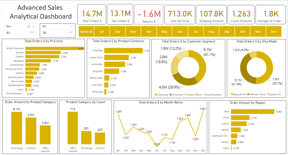
Advanced Sales Analytical Dashboard Example (Source: Eloquens)
2. Product Performance
- Automatically re-ranks when filters change
DAX
Top Products =

TOPN(5, VALUES(Products[Name]), [Total Sales])
Example:
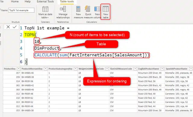
Creating top 10 products based on their sales (Source: Radacad)
3. Regional Analysis
- Shows percentage contribution per market
DAX

Market Share =

DIVIDE(

    [Region Sales],

    CALCULATE([Total Sales], ALL(Regions))

)
Example:
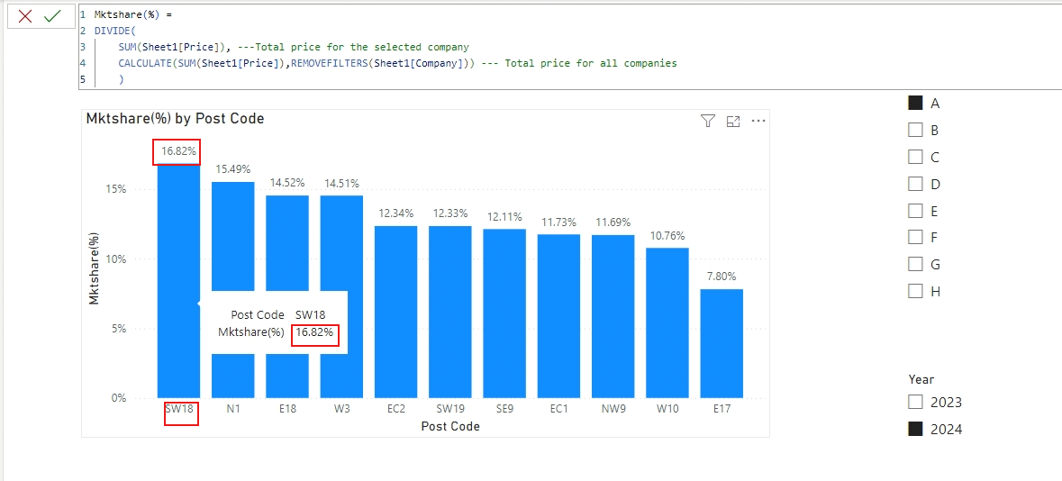
(Source: Microsoft Fabric)
Keep Growing Your DAX Skills!
As you become comfortable with the fundamentals, these advanced strategies will help you unlock even greater analytical potential:
Next-Level Functions to Master
1. SWITCH()
Replace nested IF statements with cleaner logic:
DAX

Price Tier =

SWITCH(

    TRUE(),

    [UnitPrice] > 100, "Premium",

    [UnitPrice] > 50, "Mid-Range",

    "Budget"

)
Another example of using SWITCH():
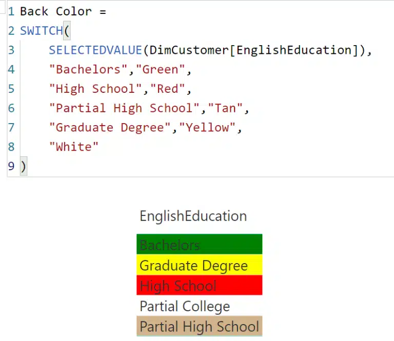
(Source: Radacad)
2. RANKX()
Create dynamic leaderboards:
DAX

Sales Rank =

RANKX(ALL(Sales[Product]), [Total Sales])
(Source: SQL Server Central)
3. FILTER()
Build complex conditions:
DAX

High Margin Products =

CALCULATE(

    [Total Sales],

    FILTER(Products, [ProfitMargin] > 0.3)

)
FILTER() with multiple conditions:
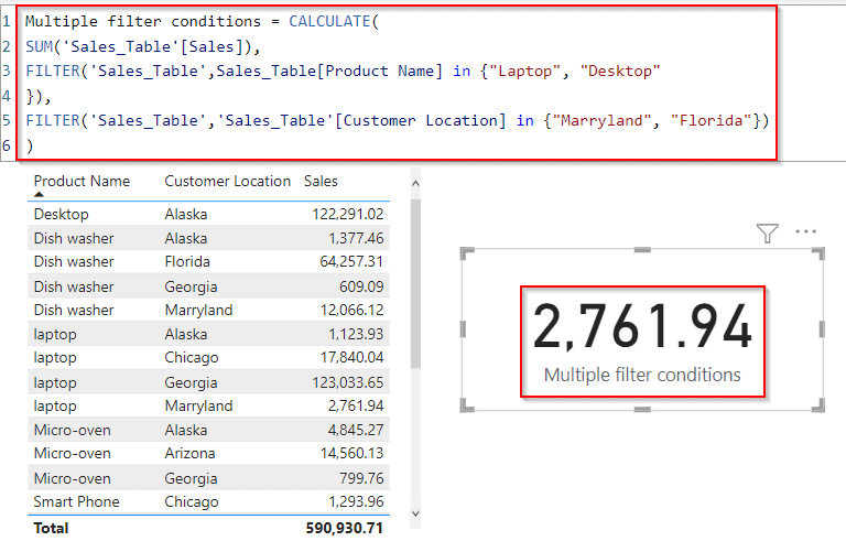
(Source: SP Guides)
Recommended Learning Path
To further your learning, here are some accessible DAX and Power Pivot tutorials you can explore:
- Data Analysis Expressions (DAX) References by Microsoft Learn
- DAX Scenarios in Power Pivot by Microsoft Support
- DAX Formulas for Excel Power Pivot by Excel Is Fun on YouTube
The best way to solidify your understanding is through practice. Apply your newfound DAX knowledge using Power Pivot sample data or by incorporating it into the sales reports you already manage!
Final Thoughts
You’ve now unlocked a new way of thinking with data. DAX isn’t just about writing formulas; it’s about asking better questions of your data and getting answers that drive action.
Here’s a simple 30-day action plan to kickstart:
- Week 1: Master 3 core functions (SUMX, CALCULATE, RELATED)
- Week 2: Build 1 automated dashboard replacing manual reports
- Week 3: Implement 1 time intelligence measure
- Week 4: Explore 1 advanced function (RANKX or SWITCH)
Remember: Every expert was once a beginner who kept going. Your future self will thank you for starting today. Now go make your data work harder, so you can work smarter!
Ready to Transform Your Data?
Mastering DAX is just the beginning—unlock the full power of Excel with @ASK Training’s expert-led courses.
Whether you’re looking to automate data workflows or build advanced dashboards, we have the perfect course to accelerate your analytics journey.
Popular Microsoft Excel Courses to explore:
- Introduction to Microsoft Excel Power Query, Data Model, Power Pivot & DAX: Perfect for beginners, learn how to connect, transform, and analyse data like a pro.
- Excel Dynamic Power Query and Power Pivot Time Intelligence DAX: Take your reporting further, master time-based analysis and dynamic dashboards.
Enrol today and transform the way you work with data!