
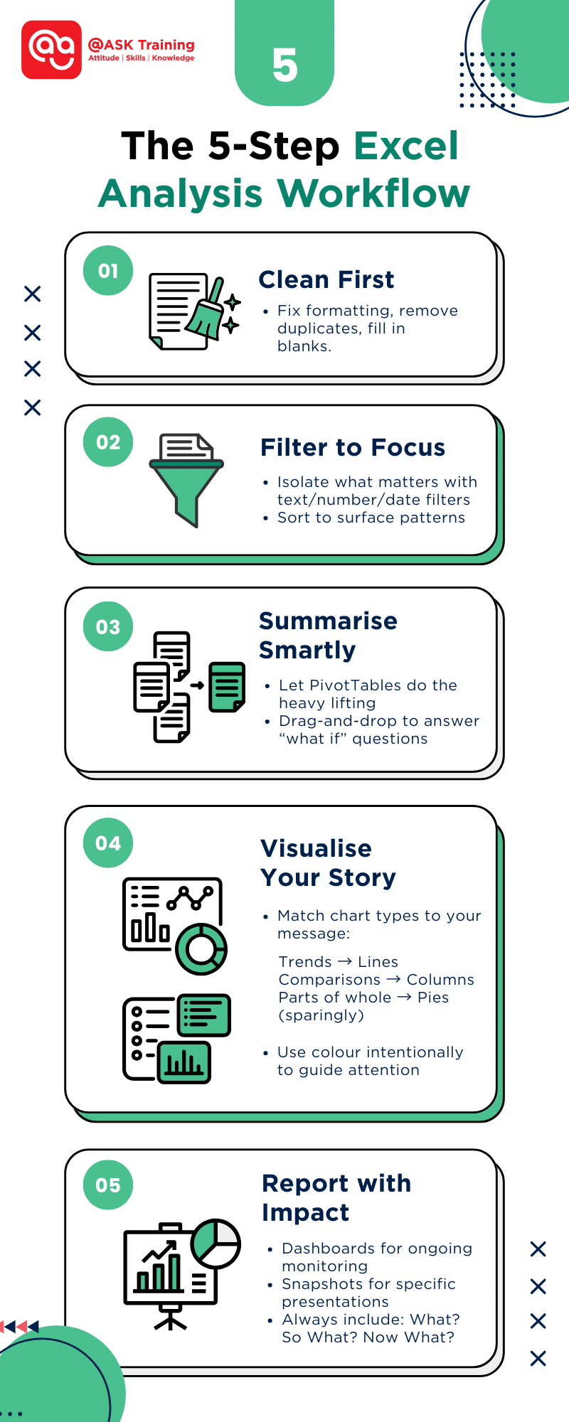
Excel is the go-to tool for everyday data analysis – flexible, familiar, and surprisingly deep. Whether you’re a marketer reviewing campaign metrics, a small business owner tracking inventory, or a student tackling your first dataset, Excel offers everything from simple sorting to advanced predictive tools.
This guide strips away the complexity. You’ll learn practical ways to:
- Clean and prep data so it’s analysis-ready
- Spot trends instantly with filters and conditional formatting
- Summarise large datasets without formulas using PivotTables
- Communicate insights clearly through charts and dashboards
Let’s dive in.
Prepare Your Data First
Before diving into Excel data analysis, ensure your data is clean and well-organised. Messy data leads to unreliable results, so follow these steps:
- Remove empty rows: Click the row number, right-click, and select “Delete”
- Fix column titles: Make sure each column has a clear name (like “Sales” or “Date”)
- Use tables: Highlight your data and press Ctrl+T to make it easier to work with
Tip: Consistent formatting (like always using DD/MM/YYYY for dates) prevents errors later.
For a deeper dive into data cleaning, explore our What is Data Cleaning? Best Practices and Methods.
Filter and Sort to Explore Patterns
When working with large datasets in Excel, filters and sorting are your first tools for uncovering meaningful information.
Think of them like a magnifying glass that helps you focus on what matters most in your data.
Using Filters to Narrow Down Data
Filters let you temporarily hide irrelevant data so you can concentrate on specific items.
For example:
- Text filters can show only products containing “Premium” in their name
- Number filters can display sales between $1,000-$5,000
- Date filters can reveal last quarter’s transactions only
To apply a filter:
- Click anywhere in your data range
- Go to Data > Filter (or press Ctrl+Shift+L)
- Click the dropdown arrow in any column header
- Select your filtering criteria
Sorting for Better Organisation
Sorting rearranges your data to surface patterns:
- Single-level sort: Alphabetise customer names or sort sales from highest to lowest
- Multi-level sort: First by region (A-Z), then by sales amount (largest to smallest)
To sort:
- Select your data range
- Go to Data > Sort
- Add levels and choose sorting order
Why this matters: These simple tools often reveal insights you might miss when looking at raw data.
For instance, filtering for a specific product category while sorting by sales amount can immediately show you your top-performing items in that category.
Now that you’ve isolated the important data, let’s look at how to use Excel to make key information visually stand out with conditional formatting.
Use Conditional Formatting to Highlight Trends
Numbers alone can be hard to interpret at a glance. That’s where conditional formatting becomes your secret weapon – it automatically colour-codes your data based on rules you set, transforming columns of numbers into a visual heatmap of insights.
Why Use Conditional Formatting?
This feature helps you:
- Spot highs and lows instantly without scanning each value
- Identify patterns that might otherwise go unnoticed
- Focus attention where it’s needed most
Practical Applications for Beginners
Try these starter techniques:
- Highlighting Top Performers
- Select your sales data
- Go to Home > Conditional Formatting > Top/Bottom Rules
- Choose “Top 10 Items” and pick a bright colour
- Finding Outliers
- Use “Data Bars” to see relative values at a glance
- Longer bars = higher values
- Setting Threshold Alerts
- Use Highlight Cell Rules to highlight cells greater than your target (e.g., >$10,000)
- Use red for values below the minimum acceptable levels
Step-by-Step Example:
Let’s format a sales report:
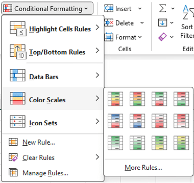
Colour Scales
- Select cells B2:B20 containing monthly sales
- Choose Home > Conditional Formatting > Colour Scales
- Pick “Green-Yellow-Red” to see:
- Green = highest sales
- Red = lowest sales
- Yellow = mid-range
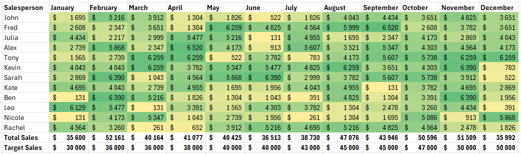
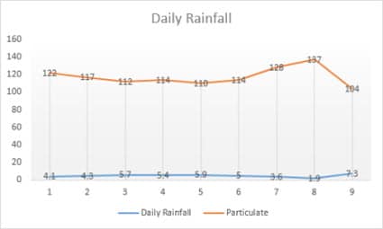
Example of Colour Scales on Excel Reports
Pro Tip: Use subtle colours for reports others will see – bright colours can overwhelm when overused.
For more advanced techniques, explore our guide on Conditional Formatting Step-By-Step Guide.
Conditional formatting gives you an instant visual assessment of your data. Now that you can see the patterns, let’s learn how to summarise this information efficiently using PivotTables.
Summarise with PivotTables
PivotTables are Excel’s smart summary tool that does the heavy lifting for you – no complex formulas required. Think of them as a magic lens that reorganises your data to reveal hidden insights in seconds.
Why PivotTables Are Game-Changers
They let you:
- Summarise thousands of rows with a few clicks
- Reorganise data on the fly by dragging fields
- Spot trends instantly without writing formulas
Your First PivotTable in 3 Simple Steps
- Prepare Your Data
- Ensure your data has clear column headers
- Remove any blank rows or columns
- Create the PivotTable
- Click anywhere in your data
- Go to Insert > PivotTable
- Click OK (Excel will guess your data range)
- Build Your Report
Drag fields to different areas:
- Rows: Categories (e.g., Products, Regions)
- Columns: Time periods (e.g., Months, Quarters)
- Values: Numbers to calculate (e.g., Sum of Sales)
Watch this tutorial video on creating a PivotTable for Windows users:
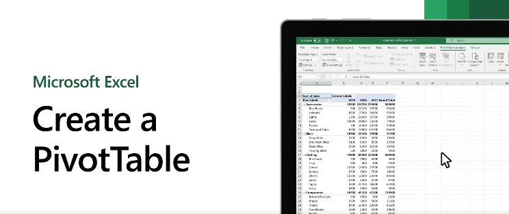
Create a PivotTable Tutorial for Windows
(Source: Microsoft Support)
Real-World Examples
Example 1: Sales by Product Category
- Rows: Product Name
- Values: Sum of Sales
Example 2: Monthly Expenses
- Rows: Expense Type
- Columns: Month
- Values: Sum of Amount
Pro Tip: Double-click any number to see the detailed transactions behind it – like peeling back layers of an onion!
Common Beginner Mistakes to Avoid
- Using incomplete data (fix blanks first)
- Forgetting to refresh when data changes (right-click > Refresh)
- Overcomplicating your first PivotTable (start simple)
Now that you’ve mastered summarising data with PivotTables, let’s bring these numbers to life with easy-to-understand visualisations.
Visualise Your Insights with Simple Charts
Numbers tell a story, but charts make that story jump off the page. Excel’s charting tools turn your data into visuals that anyone can understand at a glance—no statistics degree required.
Why Charts Matter
- See trends instantly that get lost in spreadsheets
- Compare values visually instead of scanning numbers
- Communicate clearly with managers or clients
3 Starter Charts Everyone Should Know
Column Charts
- Best for: Comparing categories (e.g., sales by product)
- Pro Tip: Use for ≤7 categories to avoid clutter
Line Charts
- Best for: Showing trends over time (e.g., monthly revenue)
- Pro Tip: Connect the dots with smooth lines
Pie Charts
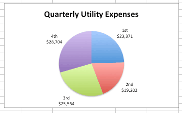
- Best for: Showing proportions (e.g., market share)
- Pro Tip: Limit to 5 slices maximum
How to Create:
- Highlight your data
- Press Alt+F1 for an instant chart
- Use the Chart Design tab to polish
Charts help you see the big picture. Next, we’ll explore Excel’s AI tool that suggests charts for you automatically.
Use the “Analyse Data” Feature for Quick Wins
Meet your new data assistant—Excel’s Analyse Data tool (Microsoft 365 only). It’s like having an analyst looking over your shoulder, ready with instant insights.
What It Can Do for You
- Auto-generate charts based on your data
- Answer questions like “What’s the trend in Q3 sales?”
- Highlight correlations you might have missed
Try This Today:
- Click anywhere in your data
- Go to Home > Analyse Data
- Type questions like:
- “Show sales by region”
- “Compare 2022 vs 2023”
Limitation Note: Works best with clean, well-organised data.
Here’s an example of how ‘Analyse Data’ works:
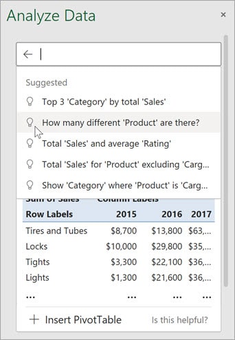
Suggested Questions You Can Try
(Source: Microsoft Support)
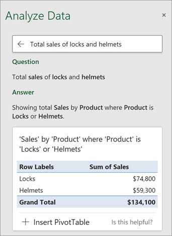
Ask Specific Questions About Your Data
(Source: Microsoft Support)
While AI tools are helpful, sometimes you need specific calculations. Let’s look at essential data analysis in Excel functions.
Useful Excel Functions for Simple Analysis
These 4 Excel functions will handle 80% of your analysis needs:
-
SUMIF
=SUMIF(range, criteria, sum_range)
- Adds up values that meet a condition
- Example: Total sales for “Product A”
-
AVERAGE
=AVERAGE(range)
- Calculates the mean value
- Example: Average monthly expenses
-
IF
=IF(logic_test, value_if_true, value_if_false)
- Makes your data “smart”
- Example: Flag sales above target
-
COUNTIFS
=COUNTIFS(range1, criteria1, …)
- Counts with multiple conditions
- Example: Transactions between $100-$500 in January
Pro Tip: Use Fx button to build formulas visually
Now let’s combine these skills into a powerful dashboard.
Dashboard in Data Analysis
An Excel dashboard has all your key metrics on a single screen, updated in real-time, telling you exactly what’s working and what needs attention.
Why Every Data Analyst Needs a Dashboard
- Instant Performance Snapshots
- See sales figures, inventory levels, and KPIs the moment you open the file
- Track progress toward goals with visual indicators
- Compare current vs. historical data at a glance
- Saves Hours of Manual Work
- Automatically pulls data from your source files
- Eliminates weekly/monthly report generation
- Updates all visuals with one Refresh click
- Always Be Prepared
- Present clean, professional visuals to management
- Answer questions immediately during meetings
- Spot trends before others see them
Building Your First Dashboard: A Practical Approach
Step 1: Identify Your Key Metrics
Start with 3-5 crucial numbers like:
- Monthly revenue vs target
- Top performing products
- Customer acquisition cost
Step 2: Choose the Right Visuals
Match metric to display types:
- Speedometer charts for goal progress
- Sparklines for trend mini-charts
- Conditionally formatted tables for detailed numbers
Step 3: Add Interactive Elements
Make it user-friendly with:
- Slicers for date range selection
- Dropdowns to filter by region/product
- Toggle switches to compare periods
Pro Tip: Keep it clean with the “3-Second Rule” – anyone should understand the main takeaway with 3 seconds of looking. Master dashboard creation with our Complete Guide to Excel Dashboards.
Remember, a great dashboard tells a story. Arrange your elements to guide the viewer from key insights to supporting details.
Now that you’ve seen how dashboards can transform raw data into actionable business intelligence, let’s recap everything we’ve covered.
Wrapping Up
Congratulations! You’ve now learned the essential framework that professional analysts use daily. Let’s recap:
Try This Today:
Pick one real dataset (your expenses, sales numbers, fitness tracker data) and apply just two techniques from this guide. What did you discover?
Your journey starts with these basic tools, but where you take them is limitless. What will you analyse first?
Ready to Excel in Data Analysis?
You’ve seen what Excel can do, now imagine what you could achieve with expert guidance.
@ASK Training is your partner in transforming spreadsheet users into data analysis experts through practical, hands-on Microsoft Excel courses tailored to real business needs.
Here are a few Excel courses worth exploring:
- Data Analysis with Microsoft Excel DASHBOARD Reporting for Management
- WSQ Microsoft Excel Mastery
- WSQ Microsoft Excel Advanced
Your data tells a story, and we’ll help you become its best narrator. Enrol with us today!
Related Courses
- Data Analysis with Microsoft Excel DASHBOARD Reporting for Management
- WSQ Data Visualisation and Storytelling with Power BI
- WSQ Data Visualisation and Storytelling with Tableau
◆◆◆
Related Articles
Article Topics
- Prepare Your Data First
- Filter and Sort to Explore Patterns
- Use Conditional Formatting to Highlight Trends
- Summarise with PivotTables
- Visualise Your Insights with Simple Charts
- Use the “Analyse Data” Feature for Quick Wins
- Useful Excel Functions for Simple Analysis
- Dashboard in Data Analysis
- Wrapping Up