
In the age of information, data is everywhere—but understanding it? That’s where the magic happens.
Whether you’re analysing web traffic, customer behaviour, or financial performance, one thing remains constant: raw data is meaningless without interpretation.
This is where visualisation becomes your superpower. In this visual guide, we’ll explore the various types of charts and graphs used for data visualisation. Packed with factors to consider for chart selections, common mistakes to avoid and a step-by-step decision framework so you can apply chart most effective for you.
Let’s dive in!
Understanding Data: Analysis and Interpretation
Data by itself is just numbers. It requires context, structure, and interpretation to become meaningful. Whether it’s rows in a spreadsheet or millions of user interactions, data analysis enables us to identify trends, patterns, anomalies, and insights.
However, analysis alone is not sufficient. Interpretation, the ability to transform insights into action, is what drives smarter decisions and better outcomes. Interpretation becomes significantly easier when data is visualised effectively.
Why Storytelling Matters in Data Analysis
Storytelling is how humans have always communicated ideas. Within the context of data, storytelling isn’t about fiction; it’s about achieving narrative clarity.
A compelling data story includes:
- A clear beginning—setting the context or identifying the problem.
- A meaningful middle—presenting analysis and observations.
- A conclusive end—offering insights or recommended actions.
Charts, graphs, and dashboards are the visual language that brings these stories to life. Without storytelling, data remains cold and clinical. With a coherent story, data becomes memorable, persuasive, and actionable.
What Kind of Story Are You Telling?
Every dataset has a story, but to tell it effectively, you must ask the right questions. First, clarify what you want people to understand. Are you highlighting growth, demonstrating a decline, comparing performance, or uncovering anomalies? Your core message guides the structure of your data story.
Next, determine the best visual representation of your message. For instance:
- Trends over time → Line or Area Chart
- Comparisons → Bar or Column Chart
- Distribution → Histogram or Box Plot
- Relationships → Scatter or Bubble Chart
- Breakdown of categories → Pie, Donut, or Stacked Bar Chart
- Processes or flows → Funnel or Waterfall Chart
Choosing the appropriate visual ensures your story is not only communicated clearly but also understood instantly.
Never underestimate the power of visuals. Humans process visuals up to 60,000 times faster than text. Effective visuals reveal hidden patterns, simplify complexity, enhance message retention, and engage audiences more deeply.
Real-World Examples of Data Visualisation
To see this in action, let’s look at some everyday scenarios where visuals bring clarity to data.
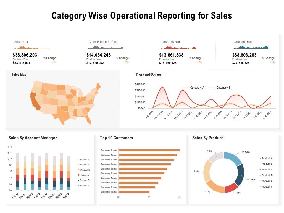
In operational reporting (below), a bar chart can compare sales across regions at a glance. A line chart can track monthly expenses, while a pie chart can break down customer types into segments that are easy to understand.
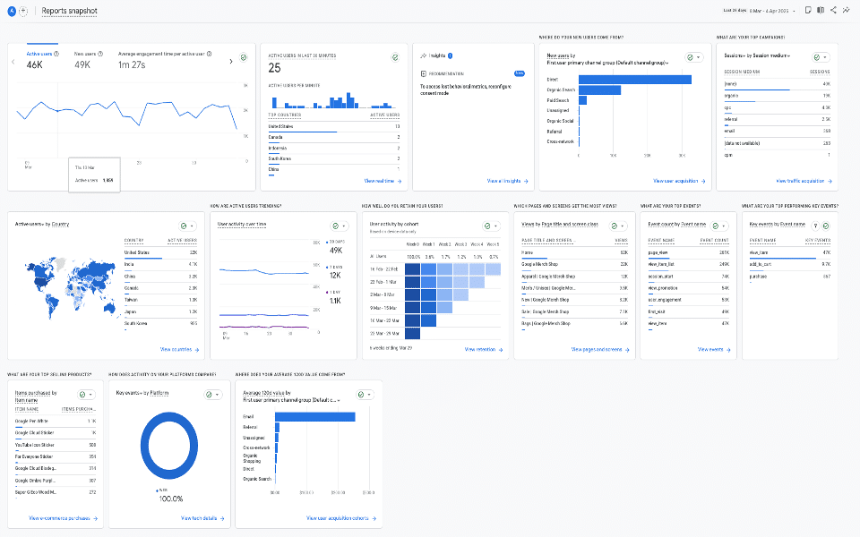
In digital marketing, a line graph can clearly show where traffic trends and website activity. A column graph can compare traffic from different sources. And a doughnut chart can break down events on your website by audiences; a heatmap will help you understand user activity over time as well.
In investing and reporting, a doughnut chart offers a clean way to show portfolio allocation. An area chart elegantly displays quarterly performance over time, and a waterfall chart breaks down an income statement to show how each component contributes to the bottom line.
The ability to visually communicate performance doesn’t just make your insights clearer; it builds trust. Stakeholders, clients, and decision-makers are far more likely to engage with data that’s easy to digest and visually compelling.
Your Ultimate Guide to Chart Types (With Examples)
Here’s a practical visual guide to the most commonly used data visualisation charts. Each includes real data and visual context to help you choose the best one.
Basic Chart Types
(Essential, widely used for common data stories)
1. Bar Chart
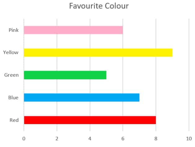
Use when: You want to compare quantities across categories.
How it works: Uses the length of horizontal bars to represent values. Longer bar = larger value.
Best for: Ranking items (e.g., top-selling products), Comparing groups (e.g., sales by region)
Example: Number of children in a class choosing their favourite colour
- Red: 8
- Blue: 7
- Green: 6
- Yellow: 9
- Pink: 6
2. Column Chart
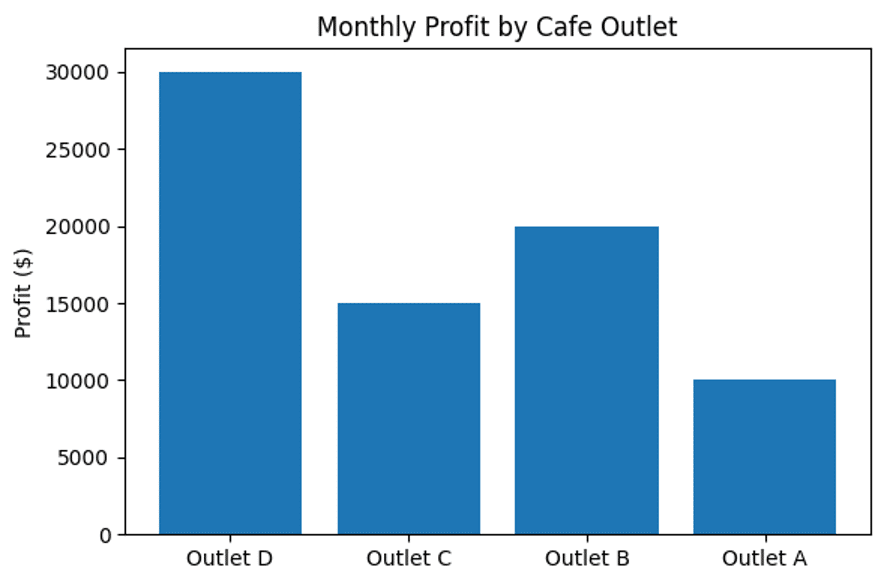
Use when: You’re comparing categories vertically.
How it works: The Height of columns shows values. Useful for limited time periods (e.g., months).
Best for: Monthly/quarterly comparisons. Few time periods (Less than 12 months).
Example: Monthly profit for different cafe outlets
- Outlet D: $30,000
- Outlet C: $15,000
- Outlet B: $20,000
- Outlet A: $10,000
3. Line Chart
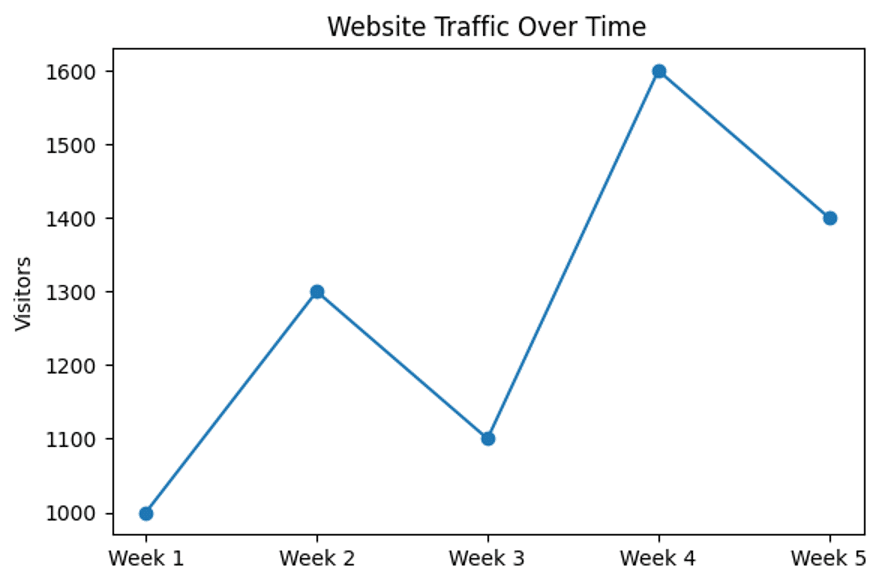
Use when: Showing a trend over time.
How it works: Connects data points with lines to emphasise continuity.
Best for: Stock prices, website traffic, year-over-year growth.
Example: Website traffic over five weeks.
- Week 1: 1,000 visitors
- Week 2: 1,300 visitors
- Week 3: 1,100 visitors
- Week 4: 1,600 visitors
- Week 5: 1,400 visitors
4. Pie Chart
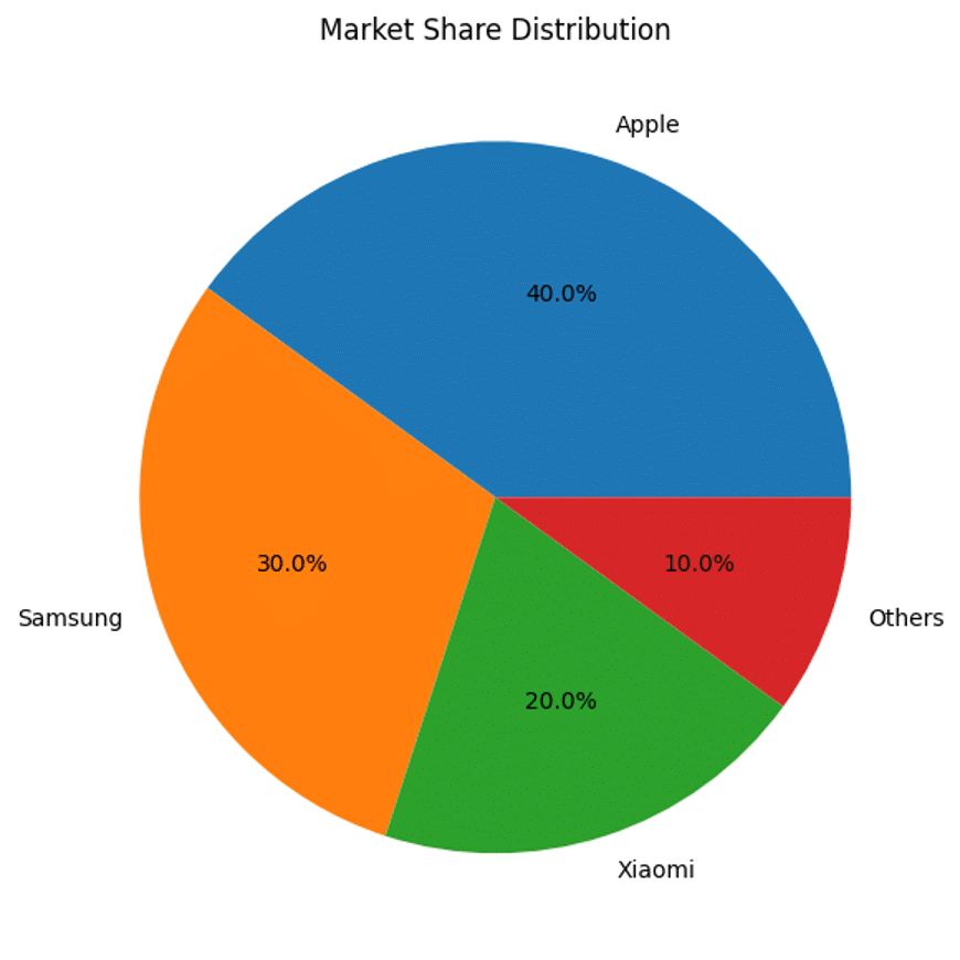
Use when: Showing parts of a whole.
How it works: Angles/slices represent proportions. Totals up to 100%.
Best for: Market share with less than 5 categories and survey responses (Yes/No/Maybe)
Example: Market share distribution.
- Apple: 40%
- Samsung: 30%
- Xiaomi: 20%
- Others: 10%
5. Doughnut Chart
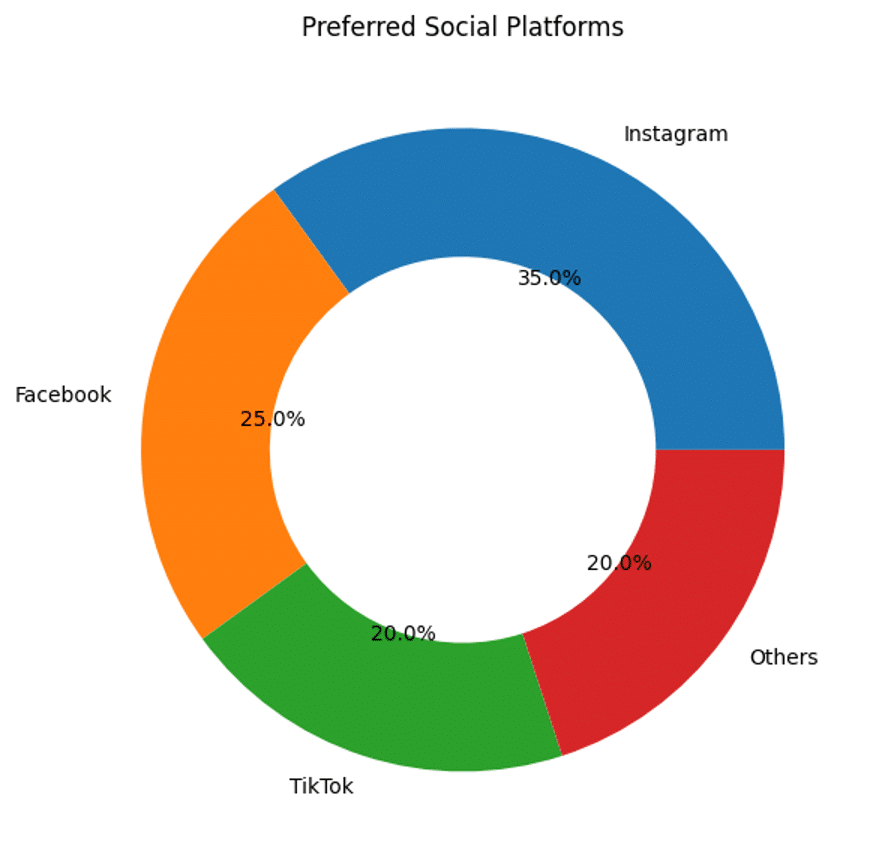
Use when: Like a pie chart, but cleaner.
How it works: Uses a hollow centre to display totals or labels. Slices represent proportions (Total = 100%).
Best for: Survey results (e.g., NPS scores) or Budget allocations of less than 5 categories.
Example: Survey responses on preferred social platform.
- Instagram: 35%
- Facebook: 25%
- TikTok: 20%
- Others: 20%
6. Scatter Plot
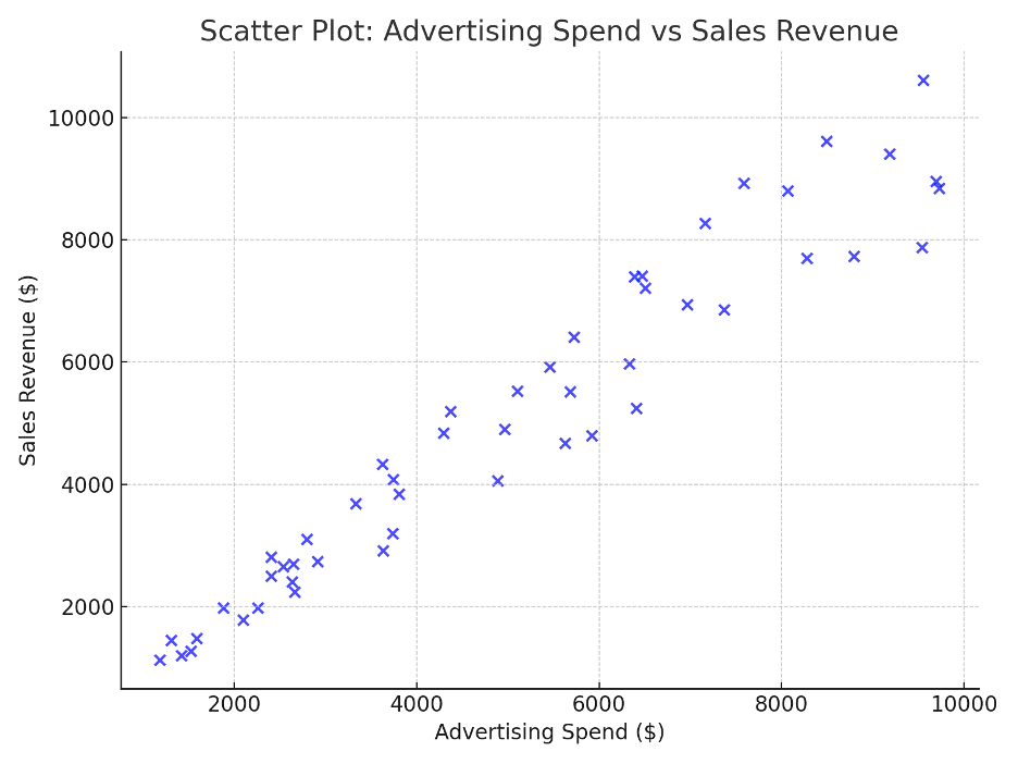
Use when: Exploring relationships between variables.
How it works: Plots dots where the X/Y axes intersect. Shows correlation clusters.
Best for: Ad spend vs Sales, Height vs Weight
Example: Advertising spend vs sales revenue.
Each point = a campaign; x = ad spend, y = revenue
Specialised Charts
(For advanced analysis or specific scenarios)
1. Bubble Chart
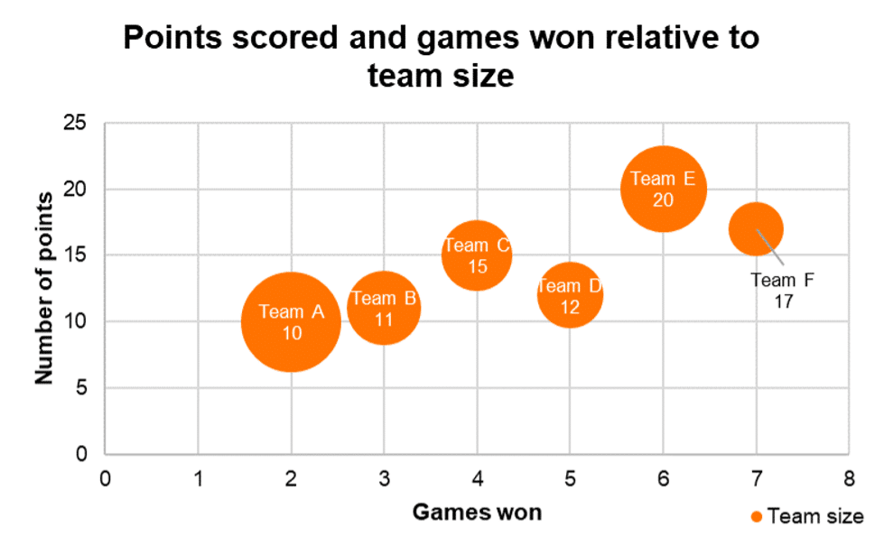
Use when: Showing three variables.
How it works: X/Y axes = bubble size = 3 variables
Best for: Campaign performance (budget, clicks, conversions).
Example: Points scored and games won.
- X: Number of points
- Y: Games won
- Bubble size: Team size
2. Histogram
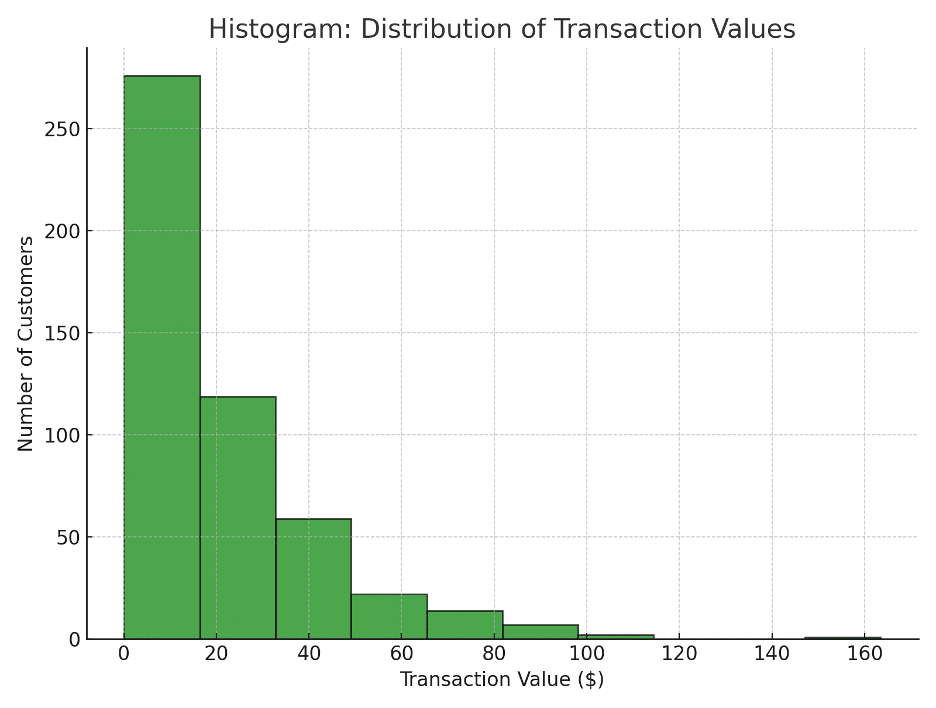
Use when: Showing distribution.
How it works: Groups values into “bins” (ranges). Taller bars = more frequent.
Best for: Age demographics, Transaction value ranges.
Example: Distribution of transaction values in a store.
- Bins: $0–10, $10–20, $20–30…
- Frequency: Number of customers
3. Box Plot
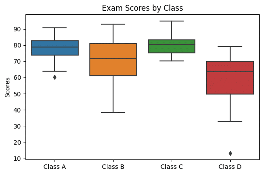
Use when: Visualising spread and outliers.
How it works: Displays median, quartiles, and extreme values.
Best for: Salary distributions, Test score comparisons
Example: Exam scores across four classes.
- Class A–D: Test score distributions
4. Area Chart
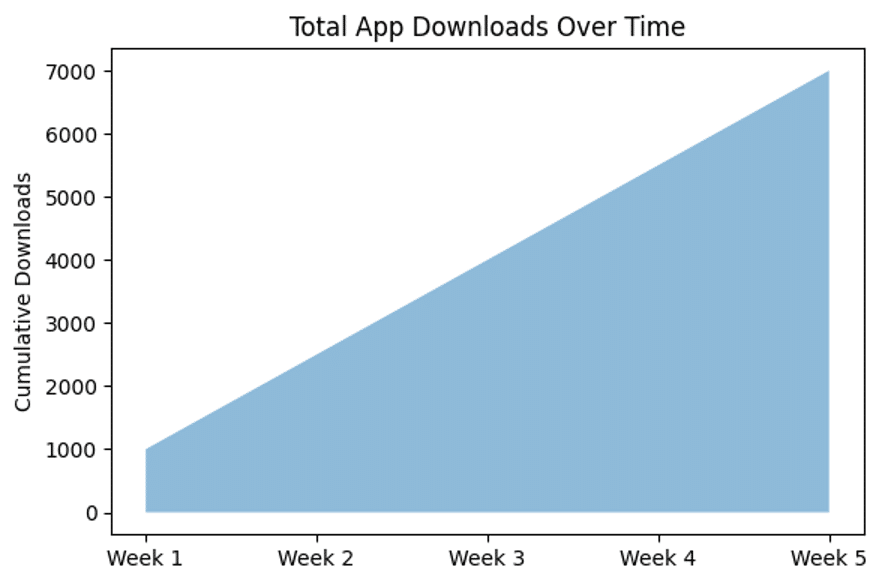
Use when: Showing magnitude over time.
How it works: Filled space under a line = volume.
Best for: Cumulative totals over time.
Example: Total app downloads per week.
- Weeks 1–5: Increasing cumulative volume
5. Stacked Column Chart
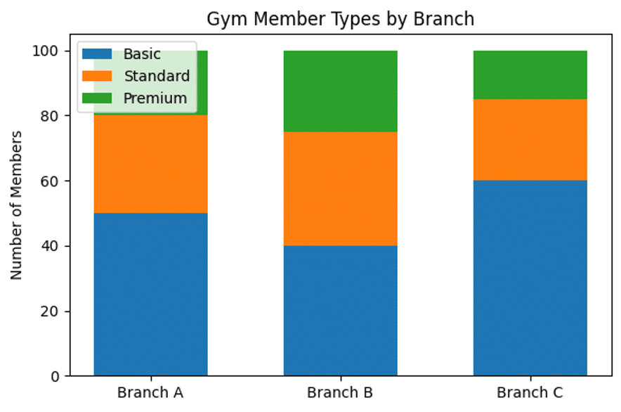
Use when: Showing composition by category.
How it works: Segments bars into sub-categories.
Best for: Part-to-whole + comparisons.
Example: Gym member types by branch.
- Each bar: Total members split by plan (Basic, Standard, Premium)
6. Radar (Spider) Chart
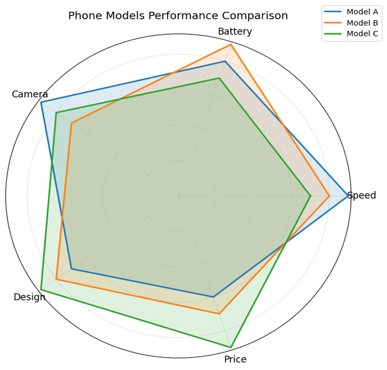 Use when: Comparing performance across multiple attributes.
How it works: Plots values on axes radiating from the centre.
Best for: Product feature comparisons, Skill assessments
Example: Comparing phone models by criteria.
- Speed, Battery, Camera, Design, Price
7. Heatmap
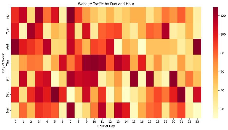 Use when: Spotting patterns in matrix data.
How it works: Colour intensity = value magnitude (e.g., dark = high).
Best for: Website clicks by hour/day, Correlation matrices
Example: Website traffic by day and hour.
- Rows: Days
- Columns: Hours
- Colour: Intensity of visits
8. Waterfall Chart
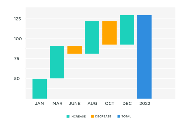 Use when: Tracking cumulative impact.
How it works: Shows starting value, additions (green), subtractions (red), and final result.
Best for: Profit/loss statements, Inventory changes
Example: Monthly net profit.
- Increase, decrease, and total net profit
9. Funnel Chart
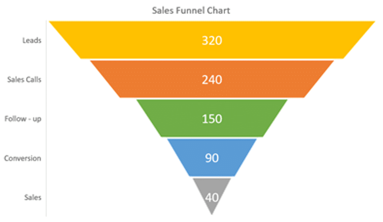 Use when: Showing drop-offs in a process.
How it works: Width shrinks to show drop-off.
Best for: Conversion/attrition analysis.
Example: Sales conversion funnel
10. Treemap Chart
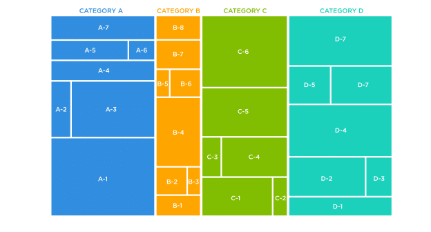 Use when: Showing hierarchical part-to-whole relationships with proportional sizes.
How it works: Divides space into nested rectangles – larger rectangles represent higher values. Colour can show additional categories.
Best for: Comparing proportions across multiple categories/sub-categories, displaying large datasets with hierarchical structure, or when exact values are less important than relative sizes.
Example: Comparing product category performance (A-D) with sub-product breakdowns.
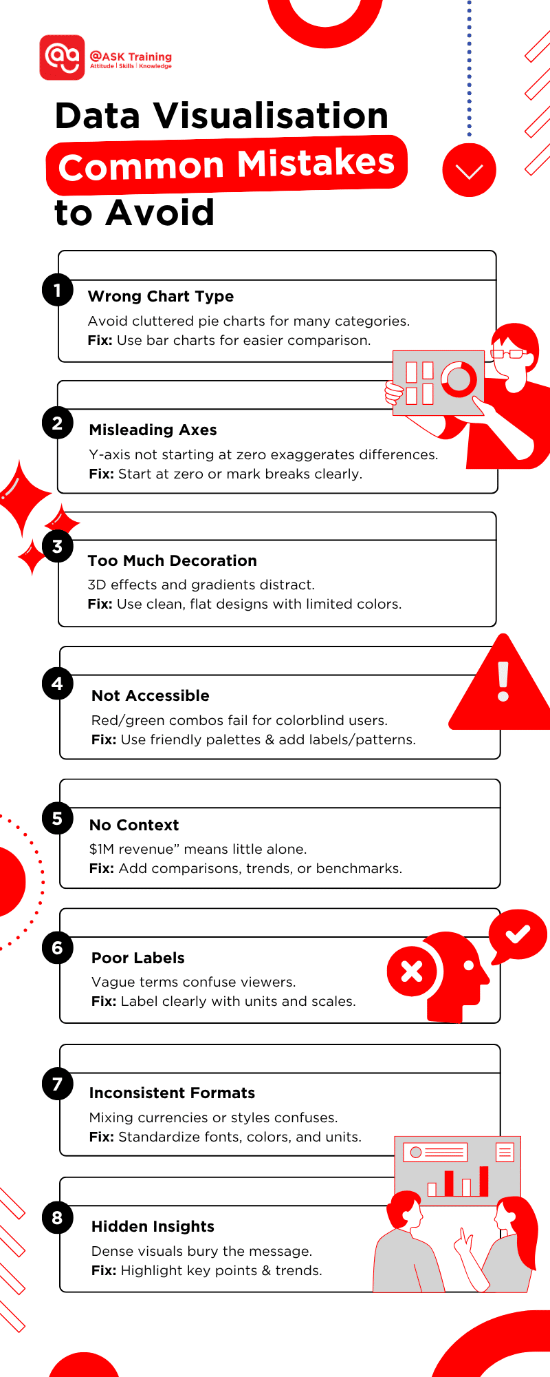
Common Mistakes to Avoid in Data Visualisation
Even the most insightful data can fail to make an impact if presented poorly. By steering clear of these common visualisation pitfalls, you’ll ensure your charts and graphs communicate clearly, accurately, and persuasively — turning raw numbers into actionable insights.
Here are several common mistakes to avoid:
1. Using the Wrong Chart Type
- Mistake: Selecting a chart that obscures your message.
- Example: Using a pie chart for 7 product categories (cluttered and hard to compare).
- Fix: Swap to a horizontal bar chart for clear category comparisons.
2. Misleading Scales or Axes
- Mistake: Distorting data perception with improper scaling.
- Example: Bar chart with a y-axis starting at 50 (exaggerates small differences).
- Fix: Always start numeric axes at zero unless justified (add a “break” marker if needed).
3. Overloading with Decoration
- Mistake: Adding unnecessary visual clutter.
- Example: 3D pie charts with shadows and gradients.
- Fix: Use flat designs, limit colours to 5-6, and remove redundant gridlines.
4. Ignoring Accessibility
- Mistake: Excluding users with visual impairments.
- Example: Red/green colour coding (indistinguishable for colourblind audiences).
- Fix: Use colourblind-friendly palettes (e.g., blue/orange) and add patterns/text labels.
5. Lack of Context
- Mistake: Presenting data without benchmarks or explanations.
- Example: Showing “Revenue: $1M” without YoY comparison.
- Fix: Add a subtitle like “15% increase vs. 2022” or overlay an industry average line.
6. Poor Labelling
- Mistake: Assuming the audience understands unlabelled elements.
- Example: Axis titled “Score” without units or definition.
- Fix: Label explicitly: “Customer Satisfaction Score (1-10 scale).”
7. Using Inconsistent Formats
- Mistake: Mixing styles within a report.
- Example: Some charts use USD, others use EUR without clarification.
- Fix: Standardise units, fonts, and colour meanings across all visuals.
8. Hiding Key Insights
- Mistake: Burying the main point in complex visuals.
- Example: A scatter plot with 100+ unannotated data points.
- Fix: Highlight key clusters/categories and add a trendline with an equation.
Before finalising, ask: ‘Can someone grasp the key takeaway in 5 seconds?’ If not, simplify. Here’s a quick recap:
Now let’s move on to the next section!
Factors to Consider When Choosing a Chart
Choosing the right chart is more than just aesthetics—it’s about aligning your visualisation with your data’s story and your audience’s needs. The wrong choice can obscure insights, while the right one makes them undeniable.
Here’s what to weigh when deciding:
1. Define Your Primary Goal
What’s the key message you want to convey? Use this as a quick reference when selecting visuals:
Chart Selection Guide
| Purpose | Definition & Example | Recommended Chart Types |
| Comparison | Show differences between categories (e.g., sales by region). | Bar, Column, Radar |
| Trend | Display changes over time (e.g., quarterly revenue growth). | Line, Area, Waterfall |
| Distribution | Reveal data spread or outliers (e.g., salary ranges). | Histogram, Box Plot, Scatter Plot |
| Relationship | Explore correlations (e.g., ad spend vs. conversions). | Scatter Plot, Bubble Chart |
| Composition | Show parts of a whole (e.g., market share by brand). | Pie, Donut, Stacked Bar |
2. Know Your Audience
How familiar are they with data visuals?
- Non-technical audiences: Simpler is better (e.g., bar/line charts).
- Experts: Can handle complex visuals (e.g., heatmaps, radar charts).
- Pro Tip: Test with a sample viewer—can they grasp it in seconds?
3. Assess Data Complexity
How many variables or dimensions are you visualising?
- 1–2 variables: Basic charts (bar, line, pie).
- 3+ variables: Advanced charts (bubble, stacked bar, scatter matrix).
- Time-based data: Prioritise line, area, or waterfall charts.
4. Consider Presentation Context
Where will the chart be viewed?
- Reports/Dashboards: Interactive elements (tooltips, filters) work well.
- Presentations: Use animated builds for step-by-step storytelling.
- Social media: Bold, minimal designs with large text for mobile viewing.
5. Prioritise Clarity Over Creativity
Avoid sacrificing understanding for style.
- Do: Use direct labels, consistent colours, and clear titles.
- Avoid: 3D effects, excessive decorations, or unconventional chart types.
Once you’ve weighed in on these factors, let’s move on to the next section on how you can apply them.
Decision Framework for Chart Selection
Selecting the perfect chart doesn’t have to be guesswork. Follow this structured framework as best practices to match your data story with the most effective visual, ensuring clarity, accuracy, and impact every time.
Step 1: Identify Primary Message
Start by crystallising your core takeaway. Ambiguous goals (“Show data”) lead to cluttered visuals.
Ask: “Should viewers walk away comparing A vs. B, seeing a trend, or understanding proportions?”
Example: “Highlight Q3’s 20% sales drop in the Midwest” dictates a bar chart comparing regions.
Step 2: Assess Data Type & Complexity
Audit your dataset’s structure before choosing a visual. Temporal data needs time-friendly charts; geospatial data demands maps. High variability might require aggregated views.
Red Flag: Forcing geographic data into a non-map chart (e.g., a pie chart for country-level stats).
Step 3: Match to Chart Types
Use this cheat sheet:
| Goal | Data Type | Best Chart | Why |
| Compare | Categorical | Bar chart | Length comparisons beat angles. |
| Trend | Temporal | Line chart | Connects points to show motion. |
| Correlation | Numeric | Scatter plot | Reveals X/Y relationships. |
Step 4: Review Against Best Practices
Pressure-test your chart:
- Readability: Can someone understand it without your explanation?
- Accessibility: Does it work in grayscale? Are labels legible at 50% zoom?
- Honesty: Does the visual distort data (e.g., truncated axes)?
Pro Tip: Print a draft in black/white to check contrast and clarity.
Now that you’re clear on how to select and apply the right chart, here are a few recommended tools and software to turn your data into visuals.
Recommended Tools and Software for Data Visualisation
Several powerful software tools simplify data visualisation. For basic charting, Excel offers user-friendly functionality accessible to most professionals.
- Tableau is ideal for creating interactive dashboards and performing exploratory analyses.
- Google Data Studio (Looker Studio) provides easy-to-use, web-based collaboration and sharing features.
- Microsoft Power BI suits those requiring comprehensive analytics integrated within Microsoft’s ecosystem.
- Canva is suitable for rapidly generating visually appealing graphics without extensive technical expertise.
Wrapping Up
Data visualisation is not exclusively the domain of analysts; it’s a universal business skill that enhances clarity, persuasiveness, and actionability. Next time when you’re presenting data, reflect on this key question:
“What story am I trying to tell, and how can I visually communicate it effectively?”
Always start by clearly defining your goal—whether it’s comparison, trend analysis, distribution, or identifying relationships—and work backward to select the most suitable chart type.
Remember, simpler visuals usually deliver clearer messages, and clarity is always your primary objective.
Let visuals amplify your voice and transform data into meaningful action!
Ready to Communicate Data Visually?
Explore how @ASK Training can help you refine your data visualisation skills, designed for professionals at every level:
- Data Visualisation and Storytelling with Power BI: Master the ability to create compelling and actionable dashboards within the Microsoft ecosystem.
- Data Visualisation and Storytelling with Tableau: Unlock the full potential of Tableau for creating visually engaging and data-rich narratives.
Transform the way you communicate data insights and get in touch with us today!
Related Courses
- Data Visualisation and Storytelling with Tableau
- Data Visualisation and Storytelling with Power BI
- Infographics Concept and Data Visualisation Technique
◆◆◆