
Many teams already have the numbers they need. Sales reports, finance trackers, HR records, marketing results and operations updates are often sitting inside Excel. The challenge is that the information is not always presented in a way that helps people understand performance quickly.
- A sales manager may have hundreds of rows of customer and revenue data, but still struggles to see which region is falling behind target.
- A finance team may update monthly expenses, but still needs extra time to explain which cost categories are increasing.
- An HR executive may track training attendance, but still needs to manually calculate completion rates before a management update.
This is where Excel KPI dashboards are useful. They turn spreadsheet data into a clearer view of performance by bringing important metrics, trends, targets and exceptions into one place.
Instead of relying on long tables or separate worksheets, users can see the key numbers that matter and understand where attention is needed.
For many Singapore workplaces, especially SMEs and department-level teams, Excel remains a practical tool for reporting and analysis. It is familiar, flexible and already available in many organisations.
While some businesses may eventually move to more advanced business intelligence platforms, Excel is often the most realistic starting point for better KPI tracking, dashboard reporting and performance reviews.
This article explains what Excel KPI dashboards are, why they are still useful, how to choose the right KPIs, how to prepare data properly, which Excel tools to use, and how to create a KPI dashboard in Excel that turns raw spreadsheet data into clearer business insights.
What Are Excel KPI Dashboards?
An Excel KPI dashboard is a visual report built in Microsoft Excel to track key performance indicators in one place. KPIs, or key performance indicators, are the metrics that show whether a business, department, campaign or process is performing as expected.
These metrics may include revenue, profit margin, conversion rate, customer satisfaction, fulfilment time, employee turnover, training completion, project progress or any other figure that reflects progress toward a business goal.
The purpose of a KPI dashboard is to make performance easier to understand. A spreadsheet may contain hundreds or thousands of rows of data, but a dashboard summarises that information into a format that users can scan more quickly.
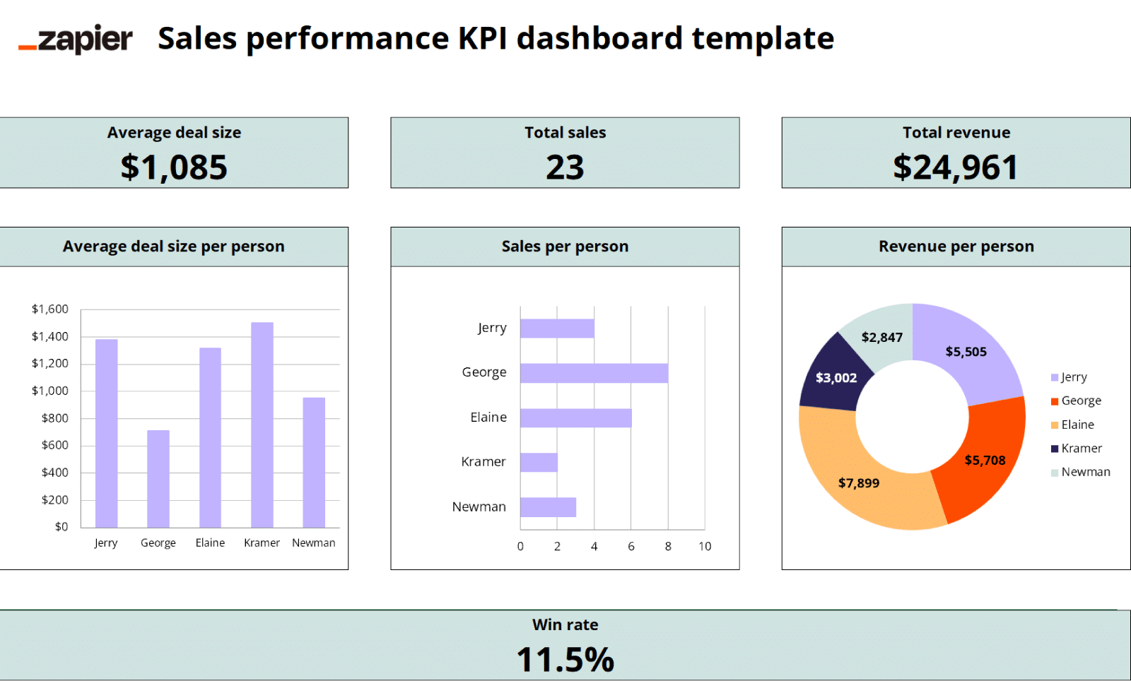
(Source: Zapier)
For example, a sales dashboard may show:
- total revenue
- revenue against target
- conversion rate
- sales by region
- top-performing products
- monthly sales trends
With this view, a sales manager does not need to inspect every transaction manually to understand whether the team is on track. The dashboard gives a faster view of where performance is strong, where it is weaker, and which areas may need attention.
Common elements of an Excel KPI dashboard include:
- KPI cards
- Charts
- Tables
- PivotTables
- PivotCharts
- Slicers
- Timelines
- Summary sections
KPI cards highlight headline numbers, charts show trends and comparisons, while slicers and timelines allow users to filter results by category or time period.
A dashboard is more than a prettier spreadsheet; it should help users answer business questions quickly and understand what the numbers mean.
Why Excel KPI Dashboards Still Matter in Modern Workplaces
There are many reporting and analytics tools available today, including Power BI, Tableau, Looker Studio and other business intelligence platforms.
What is Business Intelligence?
Business intelligence, often shortened to BI, refers to the use of tools, systems and processes to collect, organise, analyse and present business data so that people can make better decisions.
BI platforms are especially useful when organisations need:
- Automated dashboards
- Large-scale reporting
- Real-time data updates
- Access controls
- Interactive reports shared across multiple teams
Why Excel Remains Highly Relevant
Despite the rise of these advanced tools, Excel remains highly relevant because many teams still use it every day. In Singapore workplaces, Excel is commonly used for reporting, budgeting, tracking, analysis and management updates.
For SMEs, administrative teams, finance teams, sales teams and operations teams, it is often the most accessible tool because:
- Staff are already familiar with it
- The data is often already stored there
- No additional software investment is required
When Excel Dashboards Shine
Excel dashboards are especially useful when reporting needs are practical rather than enterprise-level. For example:
- A sales manager may need a weekly pipeline and revenue tracker
- A finance team may need a monthly budget-versus-actual report
- An HR team may need to monitor training completion across departments
- An operations lead may need to review fulfilment delays before a management meeting
- An SME owner may need a simple view of sales, expenses and outstanding orders
These needs do not always require a full BI implementation. In many cases, a well-structured Excel reporting dashboard can already make reporting clearer, faster and more useful.
Excel and BI Tools: Partners, Not Rivals
Excel should not be seen as a replacement for every BI tool. As an organisation grows, reporting requirements may become more complex.
Data may come from more systems, dashboards may need to be shared across departments, and access control may become more important. At that stage, tools such as Power BI may be more suitable.
Excel remains a strong foundation because the same reporting skills apply across most dashboard tools:
- choosing the right KPIs
- structuring data properly
- summarising information clearly
- designing reports around business priorities
- presenting insights in a way users can understand
Learning Excel dashboards is therefore not just about learning Excel. It is also a practical way to build stronger reporting and data analysis habits.
Start With the Right KPIs Before Building the Dashboard
One of the most common dashboard mistakes is starting with charts before thinking about the business goal. Many people open Excel and immediately ask which chart they should use, but a better starting point is to define what the dashboard needs to show and who it is meant to serve.
A dashboard for a sales director should not be designed in the same way as a dashboard for an operations manager, HR executive or finance lead. Each user has different priorities, different questions and different definitions of success.
Before building an Excel KPI dashboard, ask:
- Who will use this dashboard?
- What do they need to know?
- What targets or benchmarks matter?
- What action might they take after reviewing it?
- Which numbers truly indicate performance?
- Which details are useful, but not essential?
These questions help separate meaningful KPIs from numbers that are merely available. A number is not automatically a KPI just because it can be measured. It becomes a useful KPI when it connects to a goal, target, decision or action.
For example, if the business goal is to improve sales performance, the dashboard may include revenue, revenue versus target, conversion rate, average deal size, sales by region and pipeline value.
If the goal is to improve operations, the dashboard may focus on:
- fulfilment time
- backlog
- delay rate
- service-level performance
- productivity by team
For HR, the dashboard may track:
- headcount
- turnover rate
- training completion
- absenteeism
- hiring pipeline status
The goal is not to track every available number. Tracking too many metrics can make a dashboard harder to use because users may struggle to identify what matters most. A good Excel KPI dashboard should focus attention on the metrics that best reflect performance.
A Simple Excel KPI Dashboard Workflow
A useful dashboard usually follows a logical process. The exact steps may differ depending on the dataset, but the workflow often looks like this:
- Define the business question
- Choose the KPIs that answer that question
- Set targets or benchmarks
- Clean and structure the data
- Build summaries with formulas, PivotTables or Power Pivot
- Create charts, KPI cards and filters
- Check whether the dashboard answers the original question
Why This Workflow Matters
This workflow keeps the dashboard focused. Without it, it is easy to build an impressive-looking report that includes many visuals but does not clearly explain what is happening.
A simple Excel dashboard template can be useful as a starting point, especially for layout ideas. However, the template should always be adapted to the team’s actual KPIs, targets and reporting process.
A good dashboard reflects the business question, not just the design of the template.
Prepare Clean Data Before Designing the Dashboard
Most dashboard problems are actually data structure problems. Even a well-designed Excel dashboard can be misleading if the source data is messy, incomplete or inconsistent.
Good dashboard data is usually structured in a clean table format, with one row for each record and one column for each variable. For example, a sales dataset may include columns such as:
| Date | Salesperson | Region | Product | Revenue | Target | Lead Source |
This structure makes it easier to summarise the data using PivotTables, build charts, apply filters and refresh the dashboard when new data is added.
Messy data creates problems. Common issues include:
- merged cells
- blank rows
- inconsistent date formats
- duplicate records
- unclear column headers
- missing fields
- category names that are not standardised
Example:
If one worksheet uses “Singapore”, another uses “SG”, and another uses “S’pore”, the dashboard may treat them as different categories unless the data is cleaned first. Small inconsistencies like this can affect summaries, charts and filters.
Structure Your Workbook
A practical Excel dashboard workbook is often easier to manage when it separates the reporting process into different areas:
- Raw data: Stores the original source data
- Cleaned data/model: Prepares the information for analysis
- Calculations or PivotTables: Summarises the data
- Dashboard: Presents the final visual report
This structure makes the workbook easier to troubleshoot and reduces the risk of accidentally breaking formulas, charts or linked summaries.
Automate with Power Query
Power Query is especially useful for preparing dashboard data. It can help import data, remove duplicates, standardise formats, clean columns, combine files and refresh repeated reports.
For teams that prepare monthly or weekly reports, Power Query can reduce manual copy-and-paste work and make the reporting process more consistent.
In practice, the data preparation stage should come before the design stage. Once the source data is reliable, the dashboard becomes easier to build, refresh and trust.
Excel Tools Used to Build KPI Dashboards
Excel provides several tools for dashboard reporting. The goal is not to use every feature available, but to choose the right tools based on the reporting need.
A simple dashboard may only need Excel Tables, formulas, PivotTables and charts. A more advanced Excel reporting dashboard may use Power Query, Power Pivot, slicers and timelines.
1. Excel Tables
(Source: Zapier)
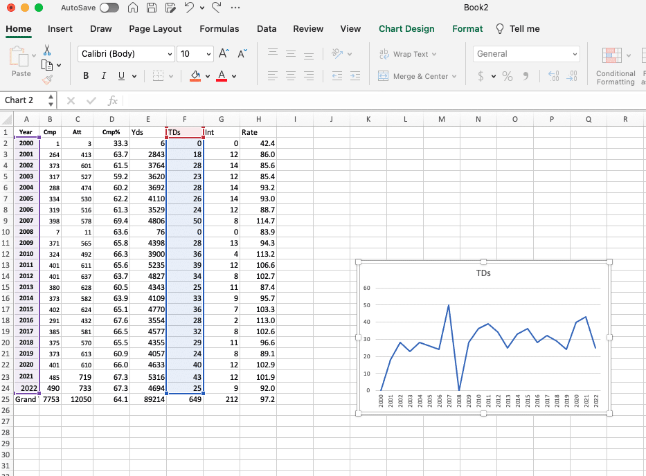
Use Excel Tables when your data grows over time, such as monthly sales records, weekly training attendance or daily service tickets.
Why they matter:
They help keep source data structured and make it easier for formulas, PivotTables and charts to refer to a consistent data range.
This is useful because dashboard data often changes. A sales report may receive new rows every month. A training report may receive new participants every week.
A customer service report may receive new tickets every day. A proper Excel Table makes it easier for the dashboard to keep working as new data is added.
2. Formulas
(Source: ExcelMojo)
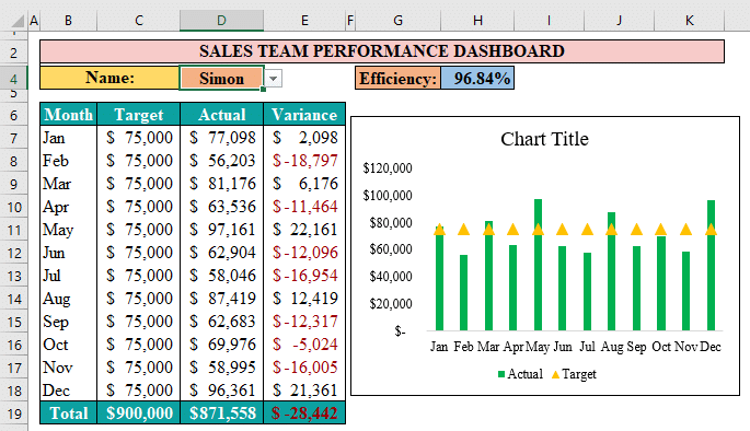
Formulas are useful for calculated KPIs such as variance, percentage achievement, growth rate, profit margin, conversion rate and average value.
Example:
A dashboard may calculate target achievement by comparing actual revenue against target revenue. It may calculate growth rate by comparing this month’s sales against last month’s sales.
Best Practice:
Formulas should be kept simple and easy to audit. Overly complex formulas can make dashboards harder to maintain, especially when multiple people use the same workbook.
3. PivotTables and PivotCharts
(Source: ExcelDemy)
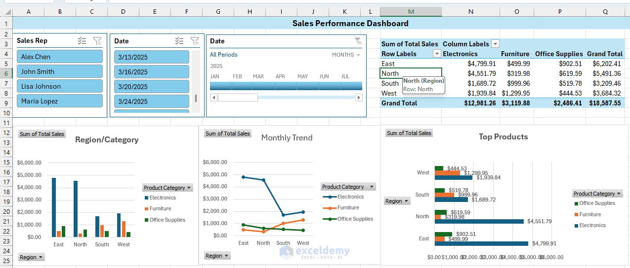
PivotTables are one of the most important tools for Excel KPI dashboards because they summarise large datasets quickly.
A PivotTable can group data by month, department, region, product, salesperson or campaign without requiring the user to build separate summary tables manually.
PivotCharts then turn these summaries into visuals. They are useful for showing trends, comparisons, rankings and breakdowns.
Example:
A PivotChart can show monthly revenue trends, expenses by department, sales by region or enquiries by source.
Why They Work Together:
Together, PivotTables and PivotCharts help turn raw spreadsheet data into views that are easier to analyse. This is why an Excel PivotTable dashboard is often a practical starting point for teams that want to improve reporting without building a more complex data model.
4. Slicers and Timelines
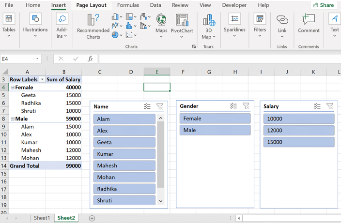
Slicers for KPI Dashboard (Source: GeeksforGeeks)
Slicers and timelines make dashboards more interactive. A slicer allows users to filter results by category, such as region, department, product, campaign or salesperson.
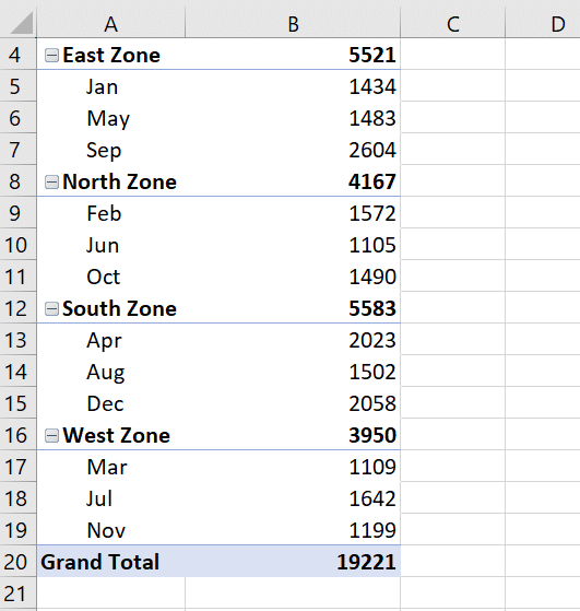
Timeline filter for KPI Dashboard (Source: GeeksforGeeks)
A timeline allows users to filter by date, such as month, quarter or year.
These tools are useful when a dashboard needs to serve different users or answer different questions without creating multiple versions of the same report. For example, a sales dashboard could use slicers to filter by region, product category or salesperson, allowing managers to review the same dashboard from different angles.
5. Conditional Formatting
Conditional formatting helps highlight important results visually. It can be used to show:
- Underperforming KPIs
- Target achievement
- Unusually high or low values
- Overdue items
- Changes in status
- Progress toward a goal
Example:
A dashboard may use red to highlight figures below target and green to show KPIs that have achieved target.
Used carefully, conditional formatting helps users notice exceptions quickly. Used excessively, it can make the dashboard look cluttered.
6. Power Query
Power Query helps import, clean, transform and combine data. This is especially useful when dashboard data needs to be refreshed regularly.
If a team receives a new sales file every month, Power Query can help standardise the format, remove unnecessary columns, clean category names and prepare the data for reporting.
This reduces repetitive manual work and lowers the risk of errors during dashboard updates.
7. Power Pivot
Power Pivot is useful for more advanced dashboard models. It can help when a dashboard needs to work with multiple related tables, such as:
- Sales transactions
- Product categories
- Customer segments
- Sales targets
- Calendar dates
How It Helps
Instead of placing everything into one large flat table, Power Pivot can connect related tables and support more advanced KPI calculations.
For beginners, Power Pivot may not be the first tool to learn. For more complex Excel dashboards, it can be very useful.
[Image placeholder: Diagram showing Raw Data → Power Query → PivotTables/Power Pivot → Charts and Dashboard]
Turning Spreadsheet Data Into Business Insights
The value of an Excel KPI dashboard is not simply that it displays data visually. Its real value is that it helps users interpret data more quickly.
It helps to separate three ideas:
| Concept | Meaning | Example |
| Data | Raw records or numbers | Daily sales transactions |
| Information | Data that has been organised or summarised | Total revenue by month |
| Insight | Meaning that helps someone decide what to do | Revenue dropped because one region underperformed |
This movement from data to insight is where a dashboard becomes useful.
A manager looking at a sales dashboard should be able to see:
- Not only the total revenue figure
- But also whether revenue is above or below target
- Whether the trend is improving or declining
- Which area is contributing most to the result
What Different Roles Need to See
An operations manager should be able to see:
- Are delays increasing?
- Which process stage is causing the backlog?
- Are service-level targets being met?
A marketing manager may want to see:
- Is campaign spend turning into leads, conversions or revenue?
A finance manager may want to know:
- Are rising expenses caused by one department, one cost category or a broader trend?
A strong dashboard guides the user’s attention. It helps answer questions such as:
- Are we on track?
- What changed?
- Where is the biggest gap?
- Which area needs attention?
- What should we investigate next?
If a dashboard cannot help answer these questions, it may be displaying data without delivering real insight.
Designing Dashboards for Faster Decision-Making
Dashboard design should support clarity, not decoration. A common mistake is to make a dashboard look impressive by adding too many charts, colours, icons and visual effects. This may create visual impact at first, but it often makes the dashboard harder to understand.
A good Excel dashboard should be easy to scan. The most important KPIs should usually appear near the top, where decision-makers can see them first. Supporting charts and breakdowns can appear below. Filters such as slicers and timelines should be placed where users can find them easily, but they should not dominate the layout.
A practical dashboard layout may look like this:
| Dashboard section | Purpose |
| Top section | Headline KPI cards |
| Middle section | Trends and target comparisons |
| Lower section | Detailed breakdowns or rankings |
| Side or top area | Slicers, timelines and filters |
Different visuals should be chosen based on what the user needs to understand:
- KPI cards for headline numbers
- Line charts for trends over time
- Bar charts for comparing categories
- Actual-versus-target visuals for performance tracking
- Tables for detailed lookup or rankings
It is also important to know what to avoid:
- Too many chart types
- Too many colours
- 3d charts
- Unclear labels
- Excessive worksheet tabs
- Visuals that look impressive but add little meaning
Good dashboard design also depends on consistency. Labels should be clear, number formats should be standardised, colours should be used with purpose, and related metrics should be grouped together.
The dashboard should reduce the effort needed to understand performance. If someone needs to spend too long figuring out what the dashboard means, the design needs improvement.
[Image placeholder: Before-and-after comparison of a cluttered spreadsheet report and a clean KPI dashboard]
Common Excel KPI Dashboard Mistakes to Avoid
Many Excel dashboards fail because they try to do too much. A dashboard that tracks too many KPIs often becomes difficult to read, especially when every metric is treated as equally important. Users should be able to identify the main message quickly.
Here are some common mistakes to avoid.
1. Tracking Too Many KPIs
A dashboard should not include every number available. When too many KPIs are shown, users may struggle to identify what matters most.
It is better to focus on the few metrics that directly support business priorities.
2. Choosing Metrics Without Business Context
A number is not automatically a KPI just because it is available.
For example, social media likes may not belong in a performance dashboard unless they connect to campaign reach, engagement quality, leads, conversions or another meaningful objective.
Similarly, website traffic alone may not be useful unless it is connected to enquiries, sales, sign-ups or other business outcomes.
3. Not Showing Targets
A KPI without a target can be difficult to interpret. If revenue is $80,000, is that good or bad? The answer depends on the target, previous performance and business context.
Dashboards should show actual results against targets, budgets, benchmarks or previous periods whenever possible.
4. Using Messy Source Data
Messy data leads to unreliable dashboards. Inconsistent dates, duplicate records, missing values and unclear categories can all affect reporting accuracy.
Data preparation is not a minor step. It is part of dashboard building.
5. Relying on Manual Copy-Paste Updates
Manual updates increase the risk of errors. If a dashboard is updated regularly, it should be designed to reduce repetitive copy-and-paste work as much as possible.
Power Query, Excel Tables and structured data ranges can help make updates more reliable.
6. Overdesigning the Dashboard
More visuals do not always create more clarity. Too many colours, chart types and decorative elements can distract users from the message.
A dashboard should use visual design to highlight meaning, not to decorate the worksheet.
7. Not Answering the Main Business Question
This is the most important mistake. A dashboard can look professional but still fail if it does not answer the user’s main business question.
Before finalising any dashboard, ask:
- Can users understand the key message quickly?
- Can they see whether performance is good or bad?
- Can they identify what needs attention?
- Can they decide what to do next?
If the answer is no, the dashboard needs to be improved.
When Excel Is Enough and When to Move Beyond It
Excel works well for many dashboard reporting needs. It is suitable when the report is owned by one team, updated weekly or monthly, based on manageable datasets and used for internal review.
Excel is also useful when reporting requirements are still changing, because spreadsheets are flexible and easy to adjust.
For many organisations, especially SMEs and smaller teams, this is enough to create meaningful improvements. A well-built Excel reporting dashboard can reduce manual reporting effort, improve KPI visibility and make business reviews more focused.
Power BI or another BI tool may be more suitable when the report needs:
- Automated refresh
- Online sharing
- Access control
- Multiple data sources
- Large datasets
- Organisation-wide reporting
- Real-time or near-real-time updates
The choice does not have to be Excel versus Power BI. In many businesses, the two tools complement each other. Excel is strong for flexible analysis, modelling and spreadsheet-based work.
Power BI is stronger for automated dashboards, broader sharing and more controlled reporting environments.
Learning to build Excel KPI dashboards is still useful even if a business later moves to Power BI, because the underlying skills remain the same: selecting meaningful KPIs, preparing clean data, designing clear visuals and building reports that support business priorities.
Practical Example: From Raw Sales Data to KPI Dashboard
Imagine a sales manager has an Excel file containing monthly sales transactions. Each row includes the transaction date, salesperson, region, product, revenue, target and lead source.
On its own, the file may contain useful information, but it may be difficult to interpret because the data is spread across many rows.
Step 1: Define the Questions
To turn this spreadsheet into a KPI dashboard, the manager first needs to decide what questions the dashboard should answer:
- Are we hitting our monthly revenue target?
- Which regions are performing best?
- Which products are driving sales?
- Which lead sources are converting?
- Is performance improving or declining over time?
- Which salesperson may need support?
Step 2: Choose the KPIs
Once the questions are clear, the manager can choose the KPIs. The dashboard may include total revenue, revenue versus target, conversion rate, top-performing region, top salesperson, monthly sales trend, sales by product category and sales by lead source.
Why These KPIs?
These KPIs are not selected randomly. They are chosen because they help the manager understand sales performance and decide where to focus.
Step 3: Build the Dashboard?
The Excel build may then use:
- Excel Table to hold the source data
- Power Query to clean and standardise the data
- PivotTables to summarise sales by month, region and product
- PivotCharts to visualise the results
- Slicers can allow the manager to filter by region or salesperson
- Timeline can allow filtering by month or quarter
- Conditional formatting can highlight whether target achievement is above or below expectations
Step 4: Uncover the Insight
The final dashboard may reveal that revenue is below target overall. Instead of stopping at that headline number, the dashboard may show that most of the shortfall comes from one region or one product category.
That is useful insight: the spreadsheet shows what happened, while the dashboard helps explain where to focus.
[Image placeholder: Sample sales KPI dashboard with revenue, target achievement, sales by region, monthly trend and slicers]
Excel KPI Dashboard Checklist
Before sharing an Excel KPI dashboard, it is worth reviewing whether it is clear, reliable and useful.
Check whether:
- The business goal is clear
- The KPIs are connected to priorities
- Targets or benchmarks are included
- The source data is clean and structured
- Formulas are working correctly
- The dashboard can be refreshed easily
- Charts are easy to understand
- Filters are clearly labelled
- The most important metrics are visible first
- The layout is simple and readable
A useful final check is to ask whether the dashboard helps someone understand what is happening and what may need attention.
Can the user tell whether performance is good or bad? Can they identify what changed? Can they see where attention is needed? Can they decide what to investigate or act on next?
If the answer is yes, the dashboard is more likely to be useful in real business reporting.
Conclusion: Excel Dashboards Are Still a Practical Business Skill
Excel KPI dashboards help teams turn raw spreadsheet data into clearer business insights. They make it easier to track performance, compare results against targets, identify trends, and focus attention on areas that need action.
The most useful dashboards are not built by adding as many charts as possible. They are built by choosing the right KPIs, preparing clean data, using the right Excel tools, and designing the layout around business decisions.
For many Singapore professionals and teams, Excel remains a practical foundation for reporting and performance tracking. It is familiar, flexible, and suitable for many day-to-day business needs.
As reporting requirements grow, teams may eventually move to Power BI or another BI tool. Excel dashboard skills remain valuable because they teach the fundamentals of good reporting: clear KPIs, clean data, meaningful visuals, and decision-focused design.
If you regularly prepare reports, track KPIs, or present business performance updates, structured Excel dashboard training can help you learn how to:
- Clean data effectively
- Build PivotTables with confidence
- Use slicers and timelines for interactivity
- Design KPI views that tell a story
- Create dashboards that are easier to update and explain during business reviews
Excel is not just a spreadsheet tool; it is a business communication tool. And a well-designed dashboard is one of the most effective ways to turn data into action.
Stop Presenting Data. Start Telling Stories.
Your data has a story to tell; learn how to make it heard. Explore @ASK Training’s range of Microsoft Excel courses in Singapore and turn spreadsheets into insights that drive decisions.
Here are a few courses we recommend:
- Data Analysis with Microsoft Excel DASHBOARD Reporting for Management – Create interactive KPI dashboards to monitor business health at a glance.
- Introduction to Microsoft Excel Power Query, Data Model, Power Pivot & DAX – Handle large datasets with Excel’s most powerful business intelligence tools.
- Advanced Pivot Table Techniques in Microsoft Excel – Build powerful PivotTables from single or multiple data sources.
Enrol with us today and turn your spreadsheets into business intelligence that speaks for itself.
Related Courses
◆◆◆
Related Articles
Article Topics
- What Are Excel KPI Dashboards?
- Why Excel KPI Dashboards Still Matter in Modern Workplaces
- Start With the Right KPIs Before Building the Dashboard
- A Simple Excel KPI Dashboard Workflow
- Prepare Clean Data Before Designing the Dashboard
- Excel Tools Used to Build KPI Dashboards
- Turning Spreadsheet Data Into Business Insights
- Designing Dashboards for Faster Decision-Making
- Common Excel KPI Dashboard Mistakes to Avoid
- When Excel Is Enough and When to Move Beyond It
- Practical Example: From Raw Sales Data to KPI Dashboard
- Excel KPI Dashboard Checklist
- Conclusion: Excel Dashboards Are Still a Practical Business Skill