
In today’s data-driven world, the ability to present complex information clearly and interactively is invaluable.
Excel dashboards are powerful tools that transform raw data into dynamic, visual summaries, enabling professionals to make informed decisions quickly.
Whether you’re tracking sales performance, monitoring marketing campaigns, or managing inventory, a well-designed dashboard consolidates key metrics and KPIs in one accessible place.
This guide will walk you through everything you need to know about creating effective Excel dashboards—from planning and data preparation to adding interactivity and visual impact.
By the end, you’ll be equipped to build dashboards that not only look professional but also deliver actionable insights.
Let’s dive in!
Understanding Excel Dashboards
An Excel dashboard is an interactive visualisation tool that summarises and displays key data points, metrics, and trends.
Unlike static reports, dashboards provide real-time insights, allowing users to explore data dynamically using filters, slicers, and drill-down features.
Core Components of a Dashboard
- Charts: Bar, line, pie, and combo charts to represent trends and comparisons.
- PivotTables and PivotCharts: For summarising large datasets and uncovering patterns.
- Slicers and Timelines: Enable users to filter data interactively.
- Conditional Formatting: Highlights critical data points using colour scales, data bars, or icons.
Excel dashboards are particularly useful for professionals who need to present data clearly, such as business analysts, marketers, and finance officers.
Let’s explore the common types of Excel dashboard and their uses.
Common Dashboard Types and Their Uses
Understanding which dashboard type best suits your needs is the first step to creating an effective data tool. Each variety serves distinct business purposes and requires slightly different approaches.
1. KPI Dashboards
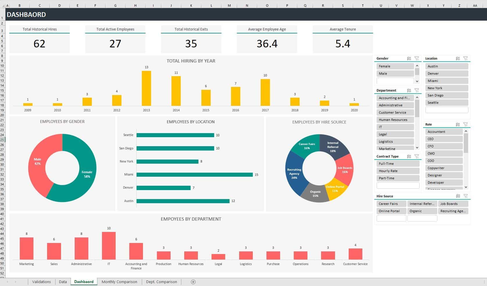
Example of Human Resources KPI Dashboard (Source: Eloquens)
- Purpose: Monitor progress toward key targets and objectives
- Key Features:
- Traffic light indicators (red/amber/green)
- Progress bars toward goals
- Conditional formatting to highlight variances
- Best For: Management reporting, project tracking
- Example: Total hiring KPI dashboard
2. Financial Dashboards
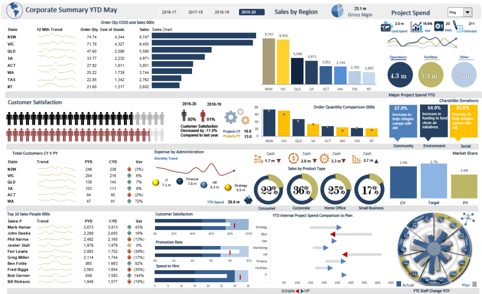
Example of Finance Admin Dashboard (Source: Eloquens)
- Purpose: Track fiscal health and cash flow
- Key Features:
- Trend lines showing YoY comparisons
- Variance analysis columns
- Waterfall charts for profit breakdowns
- Best For: Finance teams, budget holders
- Example: Corporate Summary by Finance Admin Department
3. Operational Dashboards
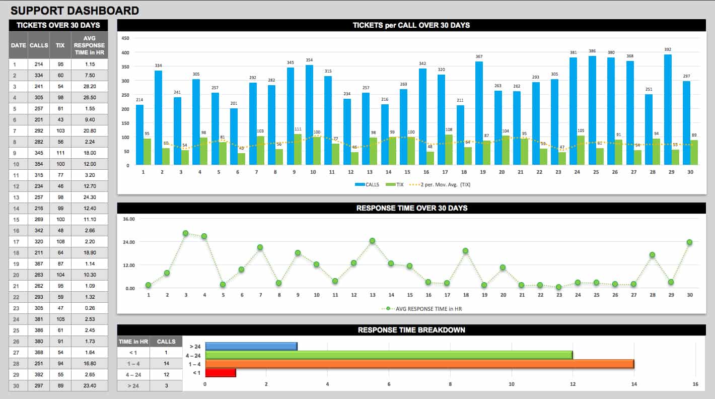
Example of Call Centres Operational Dashboard (Source: Smartsheet)
- Purpose: Monitor real-time business processes
- Key Features:
- Gauges showing capacity levels
- Live data feeds from connected systems
- Simple status indicators (up/down arrows)
- Best For: Manufacturing, logistics, call centres
- Example: Call centre tickets per call over 30 days
Pro Tip: Many dashboards combine elements from multiple types. A marketing dashboard might show KPIs (campaign performance) alongside operational metrics (website traffic).
With this understanding of dashboard types, let’s explore the key factors to create a successful dashboard.
Keys to A Successful Dashboard
Creating an effective dashboard starts long before you open Excel. Proper planning ensures your final product delivers real value.
Dashboard Planning and Goal-Setting
Before diving into Excel, define your dashboard’s purpose:
- Who is the audience? (e.g., executives, operational teams)
- What key questions should the dashboard answer?
- Which KPIs are most relevant?
A sales dashboard, for example, might focus on monthly revenue, regional performance, and product trends.
Mobile and Cross-Device Considerations
Ensure your dashboard is accessible across devices:
- Use freeze panes to keep headers visible.
- Simplify layouts for smaller screens.
- Test usability on laptops, tablets, and mobiles.
Testing and Feedback
- Gather input from end-users to refine:
- Clarity of visuals.
- Ease of navigation.
- Accuracy of formulas and interactivity.
With these fundamentals in place, we can now focus on preparing your data, the foundation of any great dashboard.
Preparing Your Data for Dashboards
A well-structured dataset is the foundation of an effective dashboard. Follow these steps:
- Organise Data Tabularly: Ensure each column has a clear header and no merged cells.
- Clean Data: Remove duplicates, correct errors, and standardise formats.
- Convert to Excel Tables: Use Ctrl + T to create dynamic tables that auto-expand with new data.
Core Elements of A Dashboard
Quality dashboards begin with quality data. Taking time to properly structure and clean your information will pay dividends later.
1. Charts
Choose the right chart for your data:
- Line charts for trends over time.
- Bar charts for comparisons.
- Pie charts for proportional data (use sparingly).
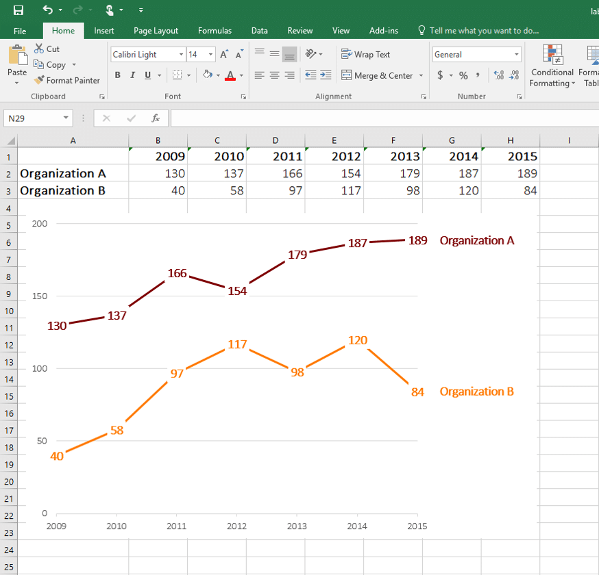
Line Chart Example (Source: Depict Data Studio)
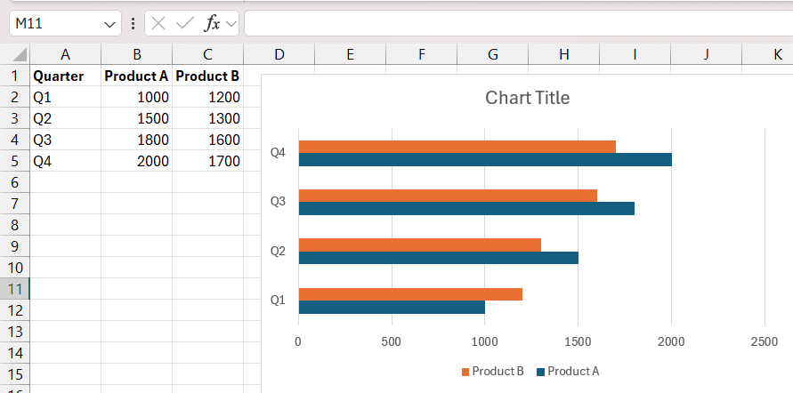
Bar Chart Example (Source: MyExcelOnline)
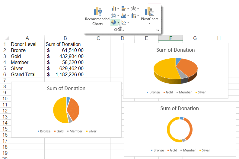
Pie Chart Example (Source: Pryor Learning)
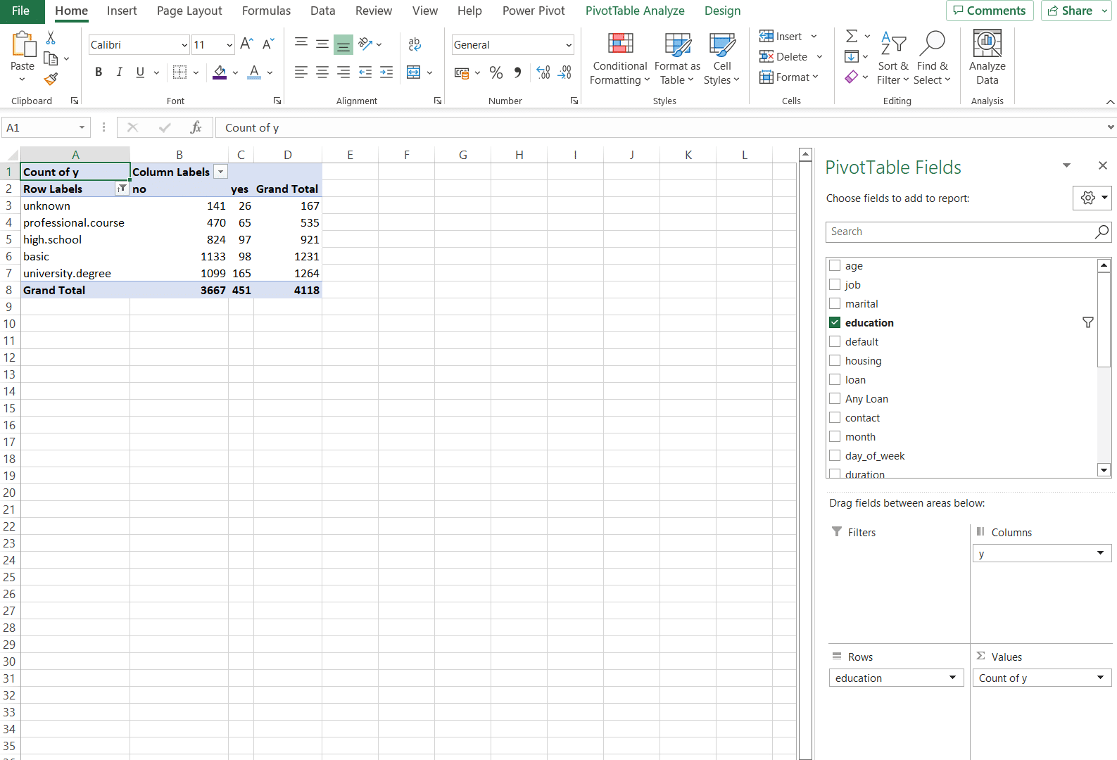
2. PivotTables and PivotCharts
Summarise large datasets quickly:
- Drag and drop fields to analyse data from different angles.
- Pair with PivotCharts for instant visualisation.
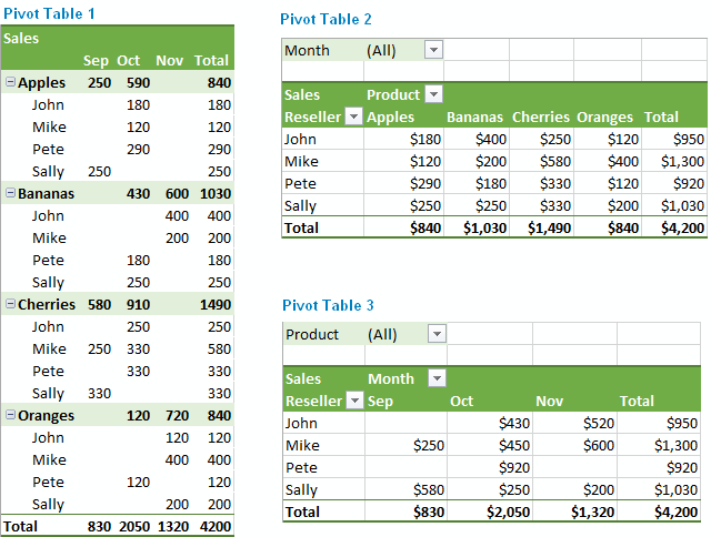
PivotTable in Excel Example (Source: Ablebits)
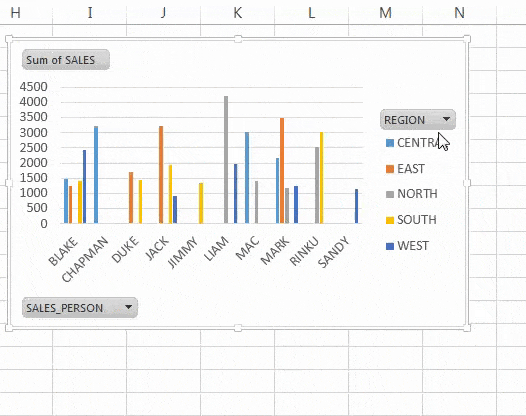
PivotChart in Excel Example (Source: WallStreetMojo)
3. Slicers and Timelines
Add interactivity:
- Slicers let users filter data with a single click.
- Timelines are ideal for date-based filtering.
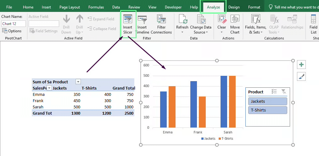
Using Slicer Example (Source: Data Camp)
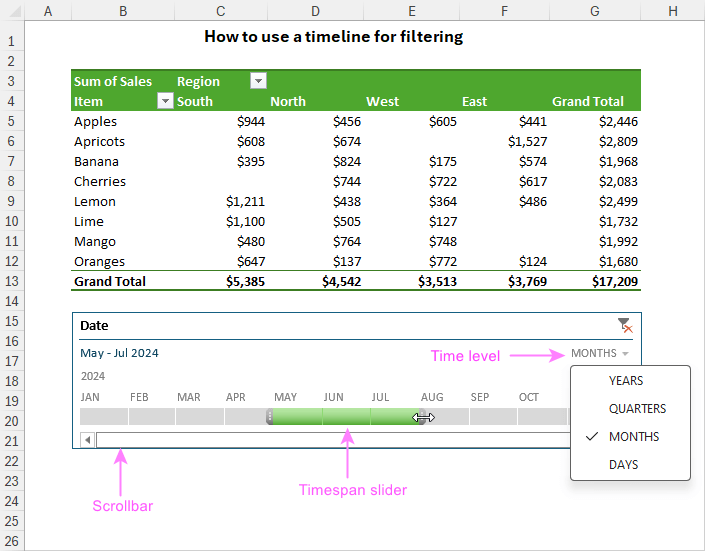
Timeline for Filtering Example (Source: Ablebits)
4. Conditional Formatting
Highlight key insights:
- Use colour scales to show performance (e.g., red for low, green for high).
- Data bars visually represent values within cells.
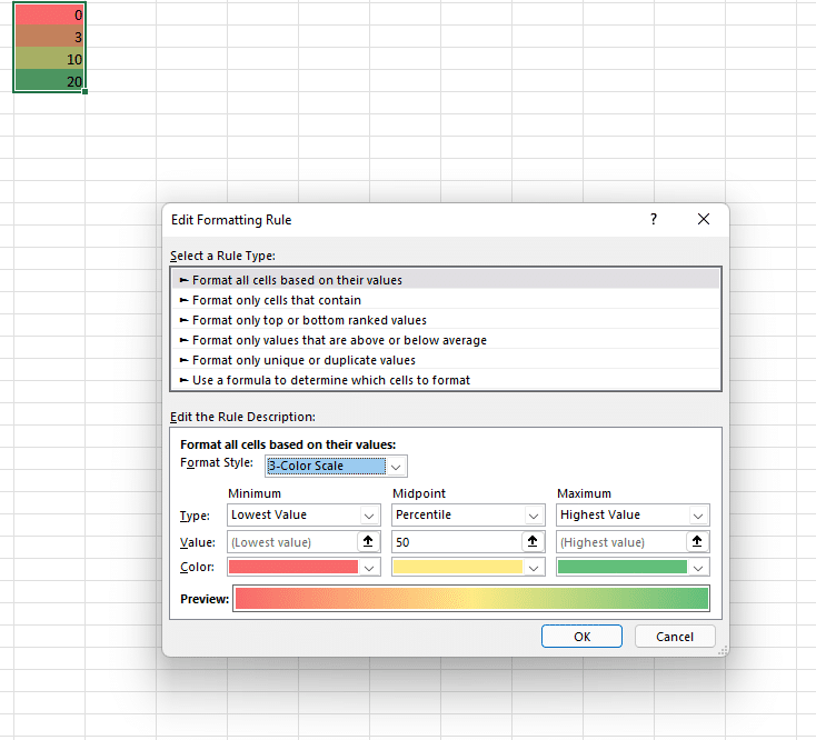
Colour Scales Example (Source: Microsoft Community)
With these elements understood, you’re ready to start building your first dashboard from scratch.
Step-By-Step Guide to Building Your First Excel Dashboard
Follow these steps to create a dynamic dashboard:
1. Import Data: Bring data into Excel via copy-paste, Power Query, or APIs.
Gather Data (Source: DataCamp)
2. Set Up Workbook: Use separate sheets for raw data, analysis, and the dashboard.
3. Create Excel Tables: Format data into tables for easier referencing.
4. Analyse Data: Use PivotTables and formulas (e.g., SUMIFS, VLOOKUP) to derive insights.
Adding into PivotTable (Source: DataCamp)
5. Design Visuals: Select charts that best represent your KPIs.
6. Assemble Dashboard: Arrange visuals logically, ensuring a clean layout.
7. Add Interactivity: Insert slicers and timelines for user-friendly filtering.
End Result Dashboard Sample (Source: DataCamp)
Now that you’ve built your dashboard, let’s explore how to take it to the next level with advanced techniques.
Tips for Dynamic and Interactive Dashboards
These professional tricks will elevate your dashboard from good to exceptional.
- Use Named Ranges: Make formulas easier to manage (e.g., =SUM(Sales_Data)).
- Dynamic Formulas: Employ OFFSET and INDEX for auto-updating ranges.
- Data Validation Lists: Let users select parameters from drop-down menus.
- Macros and VBA: Automate repetitive tasks for advanced users.
To see these principles in action, let’s examine some real-world dashboard examples.
Real-World Examples of Excel Dashboards
These practical applications demonstrate how versatile Excel data visualisation dashboards can be across different business functions.
1. Sales Dashboard
- Filters by region and product.
- Displays monthly trends and top performers.
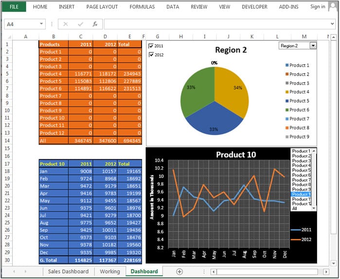
Sales Dashboard Example (Source: Excel Tip)
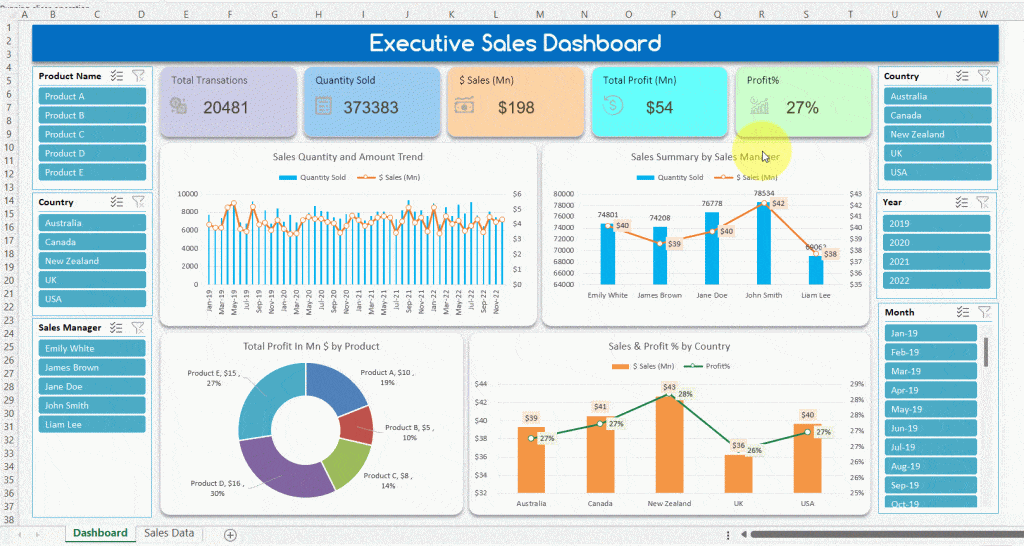
Sales Dashboard Example (Source: TheDataLabs)
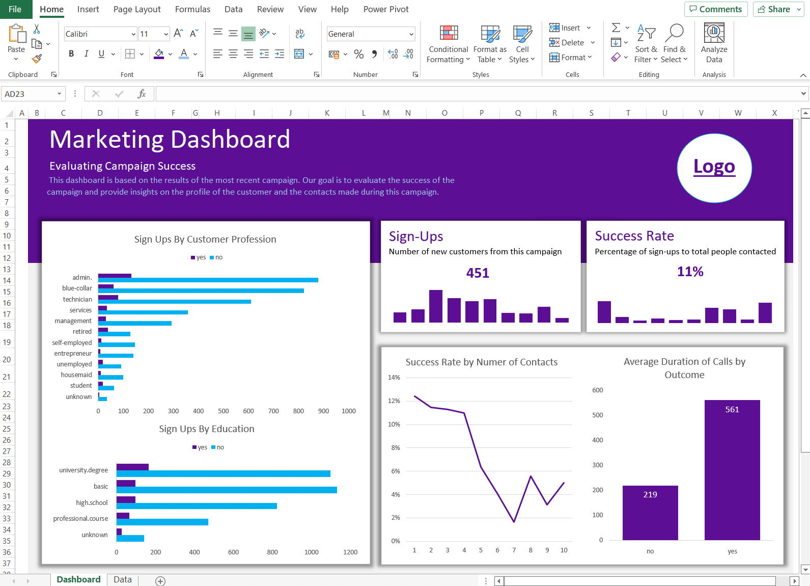
2. Marketing Campaign Tracker
- Tracks ROI, engagement rates, and conversions.
- Compares campaigns side-by-side.
![]()
Marketing Performance Dashboard Example (Source: Datapad)
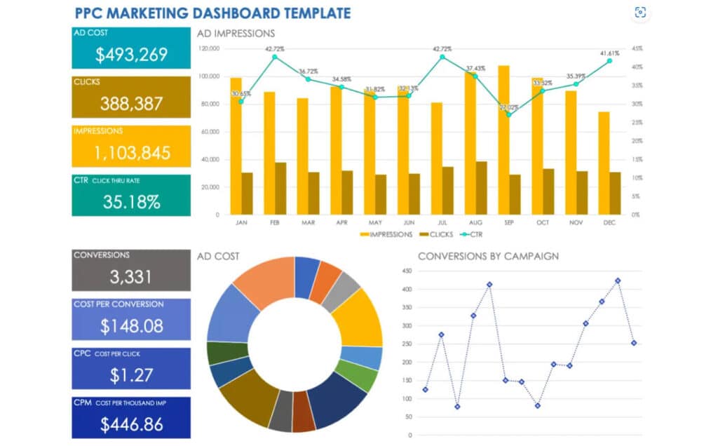
PPC Marketing Dashboard Example (Source: Oviond)
3. Inventory Management Dashboard
- Shows stock levels and reorder alerts.
- Analyses supplier performance.
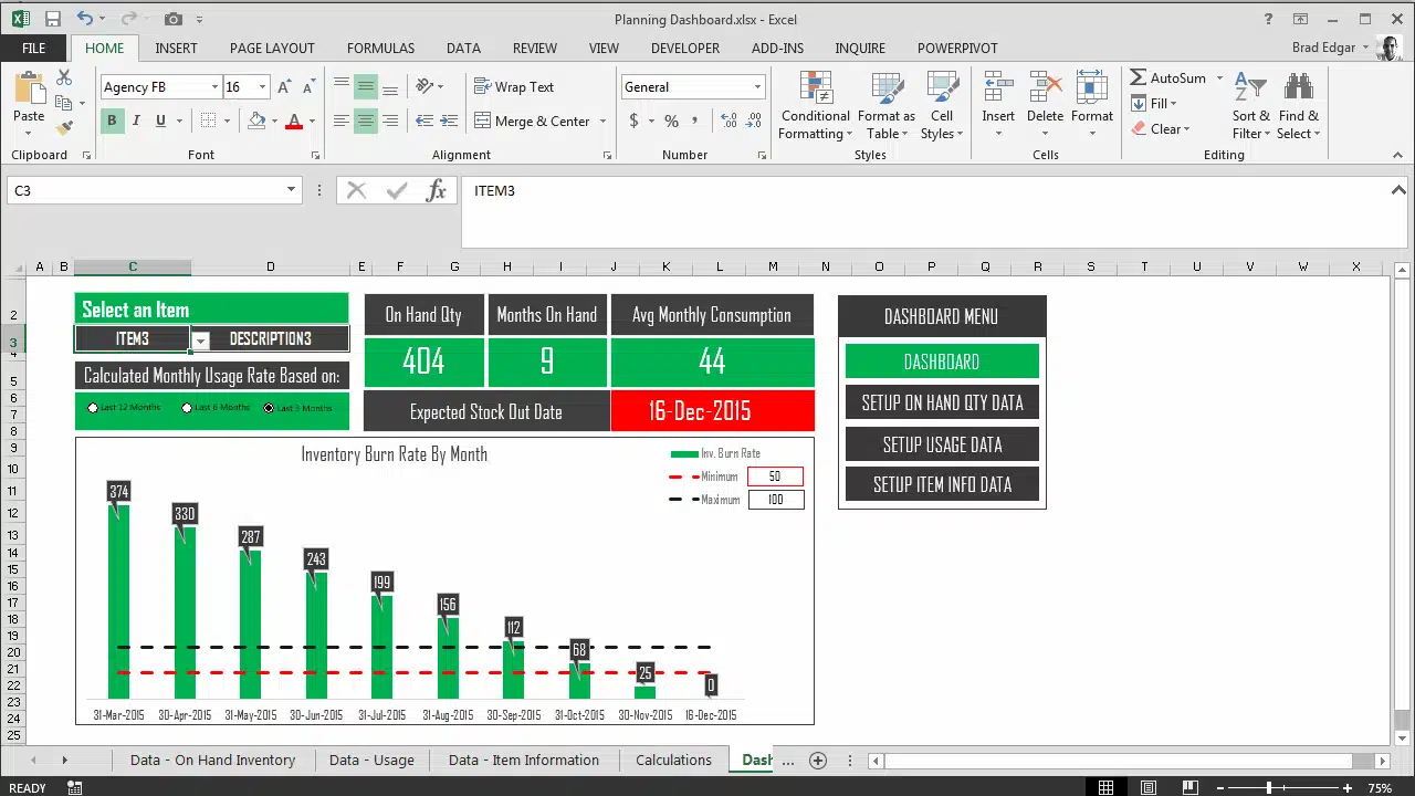
Inventory Tracking Example (Source: Brad Edgar)
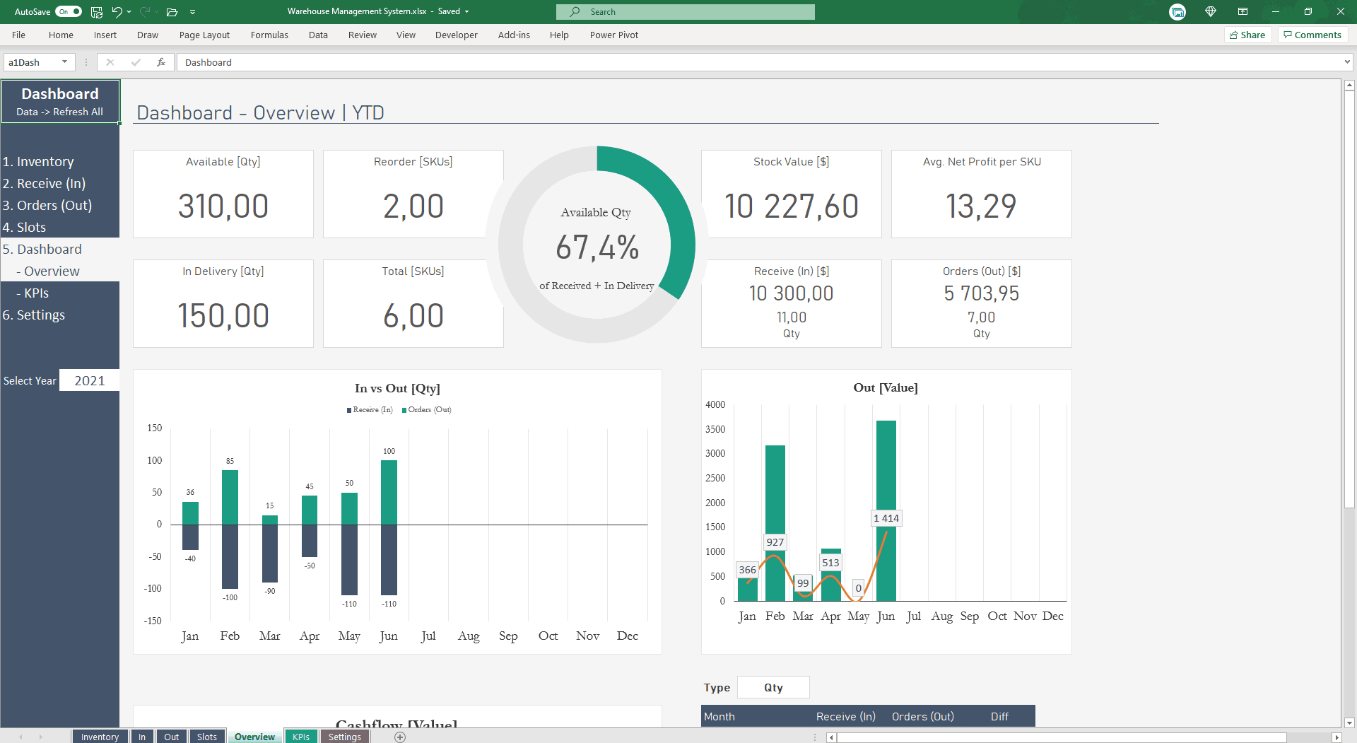
Warehouse Inventory Management Dashboard Example (Source: LuxTemplates)
While these examples showcase what well-built dashboards can achieve, even experienced professionals can stumble into common design traps.
Let’s examine these pitfalls to ensure your dashboards remain as effective as these real-world cases.
Dashboard Design Mistakes to Avoid
Even seasoned Excel users can fall into these common traps when building dashboards. Being aware of these pitfalls will help you create more effective tools from the outset.
1. The “Everything but the Kitchen Sink” Approach
Problem: Trying to display every metric at once
Solution: Apply the “5-second rule” – if users can’t grasp key insights within 5 seconds, simplify
2. Formatting Inconsistencies
Problem: Mixed colours, fonts and labelling styles
Solution: Create a style guide with:
- 3-4 colour max for data visualisations.
- Consistent date/number formats.
- Standardised header hierarchies.
3. Frozen in Time
Problem: Static data requiring manual updates
Solution: Implement:
- Power Query for automatic refreshes
- Dynamic named ranges using OFFSET
- Timestamp showing last update
4. Mobile Unfriendliness
Problem: Dashboards that break on smaller screens
Solution:
- Use larger click targets (for slicers)
- Stack elements vertically rather than horizontally
- Test on actual mobile devices
5. Assuming Intuitive Design
Problem: No instructions for first-time users
Solution: Add:
- A brief “How to Use This Dashboard” text box
- Tooltips explaining complex metrics
- Legend for all colour coding
Remember: The best dashboards undergo multiple iterations. Schedule quarterly reviews to prune outdated elements and incorporate user feedback.
Now that we’ve covered both the theoretical and practical aspects of dashboard creation, let’s explore how specialised tools can extend Excel’s native capabilities for advanced scenarios.
Tools and Add-Ins for Advanced Dashboards
Expand your dashboard’s potential with these powerful data visualisation tools that integrate seamlessly with Excel or offer enhanced capabilities.
Enhance your dashboard with:
- Power Query: Clean and transform data effortlessly.
- Power Pivot: Build complex data models and handle large datasets with ease.
- Power BI: Microsoft’s premium analytics platform for creating interactive Excel reports with enterprise-grade dashboards and advanced AI capabilities.
- Tableau: Industry-leading visualisation software that connects to Excel data for stunning publication-ready dashboards.
These tools allow you to scale beyond Excel’s native capabilities while maintaining compatibility with your existing spreadsheets.
Power BI and Tableau are particularly valuable when you need to share dashboards across organisations or require more sophisticated analytics.
Bringing it all together, you’re now equipped with comprehensive knowledge to transform raw data into powerful visual stories!
Final Thoughts
Excel dashboards are indispensable for turning raw data into actionable insights. By following this guide, you’ve learned how to plan, design, and optimise dashboards for clarity and interactivity.
Now, apply these techniques to your own datasets and elevate your data storytelling!
Take Your Dashboards from Functional to Exceptional!
From understanding core components to implementing advanced features, @ASK Training offers comprehensive Microsoft Excel courses to help you master data visualisation.
Here are a few popular courses:
- Data Analysis with Microsoft Excel DASHBOARD Reporting for Management: Master advanced Excel techniques for executive-level reporting.
- WSQ Data Visualisation and Storytelling with Tableau: Create stunning, interactive dashboards with industry-leading tools with Tableau.
- WSQ Data Visualisation and Storytelling with Power BI: Transform raw data into compelling business insights with Power BI.
Enrol today and happy dashboarding!
Related Courses
- Data Analysis with Microsoft Excel DASHBOARD Reporting for Management
- WSQ Data Visualisation and Storytelling with Power BI
- WSQ Data Visualisation and Storytelling with Tableau
◆◆◆
Related Articles
Article Topics
- Understanding Excel Dashboards
- Common Dashboard Types & Their Use Cases
- Keys to A Successful Dashboard
- Preparing Your Data for Dashboards
- Core Elements of A Dashboard
- Step-By-Step Guide
- Tips for Dynamic & Interactive Dashboards
- Real World Examples
- Dashboard Design Mistakes to Avoid
- Tools and Add Ins for Advanced Dashboards
- Final Thoughts