WSQ Data Visualisation and Storytelling with Tableau

Nett Course Fee
$343.20
Course Description
The increased popularity of big data and data analysis projects has made visualisation more critical than ever! Data visualisation provides a quick and effective way to communicate information universally using visual information.
Learning Tableau could give one a leg up on getting jobs and advancing one’s career in a data-driven business world. Whether in marketing, operations, strategic planning, product development, HR, or other aspects of business, data helps companies make smarter decisions.
The two days workshop focuses on applied learning that aims to enhance your ability to use Tableau in identifying which factors affect businesses and pinpoint areas that need to be improved or need more attention, including making data memorable with storytelling.
Prerequisites
- Age: Minimum 18 years old
- Minimum of GCE O levels academic qualification or Workplace Literacy and Numeracy (WPLN) score: Level 5 for Reading, Speaking, Listening, Writing and Numeracy
- At least 1 year of working experience
- Basic knowledge with computer software like Microsoft Excel.
Course Objectives
At the end of the course, you will be able to:
- Use different tools for data visualisation with Tableau.
- Identify various methods to portray data patterns, trends, and correlations, including optimally presenting the data and findings.
- Design and create features of data displays, including navigation, layout, user interface, and user experience of interactive graphics.
- Recognise dashboard development process and techniques, including developing dashboards and marks cards that incorporate advanced visualisation techniques and embed with analytics capabilities.
- Communicate data in the form of storytelling
Certification
Upon successful completion of the WSQ Data Visualisation and Storytelling with Tableau assessment, participants who have attended at least 75% of the course will receive a SkillsFuture WSQ Statement of Attainment (SOA) along with a Certificate of Achievement by @ASK Training.
Course Outline
Introduction and Fundamentals of Tableau
- You will learn to identify and distinguish new or emerging visualisation tools and techniques.
Dashboards
Data Management
- You will learn to identify a range of methods that can be used to portray data patterns, trends, and correlations, including analysing the presentation of data.
Storytelling with Data
- You will learn to address critical questions from key stakeholders and communicate data through storytelling.
Creating Custom Visuals
- You will learn strategic visualisation and mapping techniques, including designing and creating features of data displays.
Fees and Subsidies

*Eligible for Singaporean Citizens, Permanent Residents, and Long-Term Visit Pass Plus Holders
Course Fee:
S$959.20 (exclusive of 9% GST)
Course Fee After Eligible SSG Subsidies:
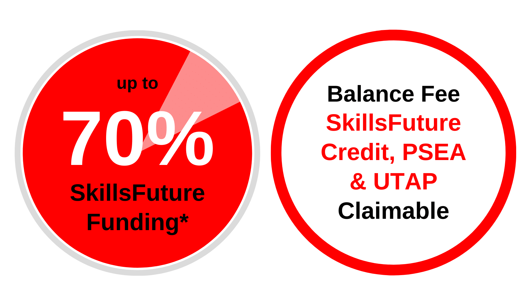
From S$343.20 (inclusive of 9% GST) after 70% SSG Subsidies
| Learners | |
| Singaporean Citizens ≥ 40 years old | S$343.20 (after SSG 70% Funding) SkillsFuture Credits can be used on top of existing subsidies |
| Singaporean Citizens, PRs or LTVP+ Holders ≥ 21 years old |
S$519.20 (after SSG 50% Funding) For Singapore Citizens aged 17-30 Post Secondary Education Account Funds can be used. |
| Learners | SMEs | Non-SMEs |
| Singaporean Citizens ≥ 40 years old | S$343.20 (after SSG 70% Funding) SkillsFuture Enterprise Credits (SFEC) can be used on top of existing subsidies |
S$343.20 (after SSG 70% Funding) SkillsFuture Enterprise Credits (SFEC) can be used on top of existing subsidies |
| Singaporean Citizens, PRs or LTVP+ Holders ≥ 21 years old | S$519.20 (after SSG 50% Funding) SkillsFuture Enterprise Credits (SFEC) can be used on top of existing subsidies |
All prices are inclusive of 9% GST.
You may use U-tap to defray 50% of the unfunded course fee, capped at $250/year. NTUC members aged 40 and above can enjoy higher funding support up to $500/year for courses attended between 01 April 2022 to 31 March 2023. Head to our UTAP Funding page for more information.
Important Reminder: Your PSEA claim needs to be submitted at least 1 month before the course’s commencement date. Should you miss this deadline, an alternative payment method must be used to secure your spot in the course. After the disbursement of your PSEA funds to us, we will reach out to initiate the refund process.
Related Courses
Data Analysis with Microsoft Excel DASHBOARD Reporting for Management
The course “Data Analysis with Microsoft Excel DASHBOARD Reporting for Management” offers a tailored training to create informative, customizable, and interactive dashboards that visually present key performance indicators (KPIs), metrics, and data points, allowing quick monitoring of business health and simplifying complex data sets for easy performance awareness.
Course Duration:
2 Days (9.00am – 5.00pm)
View course details here
Data Visualisation and Storytelling with Power BI
This two-day workshop emphasizes practical skills in utilizing Power BI to analyze trends, generate intuitive and interactive visuals, and effectively communicate data insights to key stakeholders.
Course Duration:
2 Days (9.00am – 5.00pm)
View course details here
WSQ Data Visualisation and Storytelling with Tableau
Course Duration:
2 Days (9.00am – 6.00pm)
Course Fee Details:
$343.20 (incl. of 9% GST) after 70% SkillsFuture Subsidy
SkillsFuture Credits, PSEA & UTAP claimable
Course Code: TGS-2022016332
Course Schedule
| Course | Duration | Months | Available Date(s) | Venue | Remarks | ||||
|---|---|---|---|---|---|---|---|---|---|
| Data Visualisation and Storytelling with Tableau TGS-2022016332 | 2 Days (9:00am – 6:00pm) | July 2025 | 17-18 | International Plaza | Weekdays | ||||
| August 2025 | 21-22 | JTC Summit | Weekdays | ||||||
| September 2025 | 25-26 | Mountbatten Square | Weekdays | ||||||
| October 2025 | 16-17 | International Plaza | Weekdays | ||||||
| November 2025 | 20-21 | JTC Summit | Weekdays |
