Data visualisation is the art and science of transforming raw data into meaningful insights through graphical representations. In today’s data-driven world, it is a critical skill for understanding and communicating complex datasets effectively.
Well-designed visualisations not only make data easier to interpret but also enable decision-makers to grasp insights quickly and take action.
Overview of Data Visualisation Market
Over the years, data visualisation has evolved significantly, thanks to technological advancements. From static charts in Excel to interactive dashboards powered by artificial intelligence (AI), the tools and techniques available today offer unparalleled capabilities.
It is projected that the global data visualisation tools market to reach US$10.8 billion by 2027.
This rapid growth reflects the increasing demand for sophisticated tools that simplify complex data into visually appealing formats which empowers you and organisations to make better decisions and derive actionable insights across various sectors.
To illustrate the evolving landscape of data visualisation tools, the Gartner Magic Quadrant gives you a comprehensive view of top players in the market. This helps you evaluate vendors based on their ability to execute and completeness of vision.
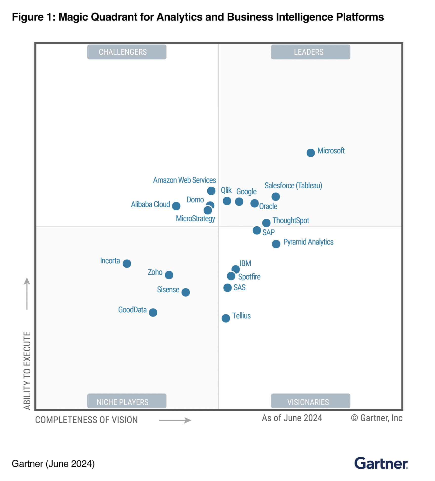
Gartner Magic Quadrant
(Source: Google)
This article will explore the best data visualisation software tools leading the way, emerging trends shaping the field, and real-world examples of impactful visualisations.
Top Data Visualisation Tools in 2025
As the demand for data visualisation grows, a variety of tools have emerged to cater to different needs and expertise levels. Below, we delve into five data visualisation tools in 2025, their unique features and real-world applications of data analysis tools to help you make informed decisions about which tool best suits your needs.
1. Tableau
Tableau remains a gold standard in the world of data visualisation due to its intuitive design and robust capabilities. Whether you’re a seasoned analyst or a newcomer, Tableau offers tools to transform complex datasets into clear, interactive dashboards.
(Source: Tableau)
Ease of Use: Create visuals effortlessly with its rag-and-drop functionality, even with minimal training.
Advanced Features: Perform deep analytics with forecasting tools and machine learning integrations.
New in 2025: Enhanced AI-assisted dashboard building, which suggests optimal charts and layouts based on your dataset.
Applications: Widely used in marketing analytics, Tableau helps businesses analyse customer behaviours to optimise campaigns. Retailers can track regional sales trends for better inventory management.
Pricing Model: Tableau Viewer starts from US $15 per user per month, as for enterprise, Enterprise Viewer starts from US $35 per user per month. Both are billed annually.
Pro Tip: Take advantage of Tableau’s built-in Story feature to present a guided narrative, enhancing viewer understanding.
Now that you’ve seen how Tableau simplifies complex data handling, let’s move on to another leader in enterprise-level visualisation.
2. Microsoft Power BI
Power BI stands out for its seamless integration with Microsoft’s suite of products, making it a natural choice for businesses already using tools like Excel and Sharepoint. Its focus on real-time analytics makes it indispensable for enterprise operations.
(Source: Microsoft Learn)
Seamless Ecosystem: Easily import and work with data from Microsoft tools and other third-party platforms.
AI Insights: Make use of AI to identify trends, forecast outcomes, and uncover hidden correlations in your data.
New in 2025: An upgraded collaboration hub for teams to co-author and comment directly on dashboards, enhancing teamwork and productivity.
Applications: Power BI excels in supply chain optimisation. For example, logistics companies monitor shipments and forecast delays using real-time dashboards.
Pricing Model: You can utilise Power BI for free with limited features. Power BI Pro charges US$10 per user per month. However, starting from April 1, 2025, Microsoft announced its price increase to US$14 per user per month.
Pro Tip: Utilise its natural language processing (NLP) feature to query data conversationally, making analytics more accessible to non-technical users.
Power BI’s enterprise focus is clear, but if you’re looking for something that takes exploration to the next level, consider this next tool.
3. Qlik Sense
Qlik Sense empowers users to explore data without predefined query paths, thanks to its associative data model. Its focus on uncovering relationships makes it particularly valuable for deeper data exploration.
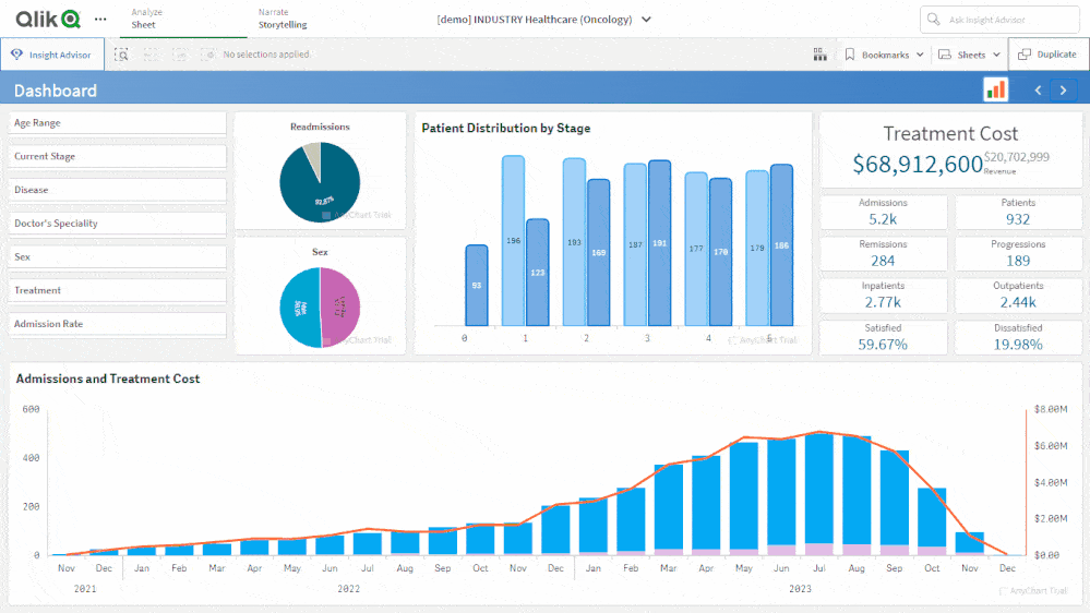
(Source: Qlik Sense)
Unique Approach: Explore all possible connections within your data, ensuring no insights are overlooked.
Interactive Design: Build visually engaging dashboards with tools tailored for customisation.
New in 2025: Smart Data Alerts, which notify users of significant trends or anomalies in real-time.
Applications: In healthcare, Qlik Sense allows hospitals to monitor patient outcomes, while universities use it to predict student success and retention rates.
Pricing Model: While the pricing model for Qlik wasn’t specifically mentioned, you can contact their team to learn more.
Pro Tip: Use Qlik’s Insight Advisor to gain AI-driven suggestions for visualisations, streamlining your workflow.
As Qlik Sense pushes the boundaries of interactive exploration, D3.js offers unmatched customisation – let’s see how it stands out.
4. D3.js
For those seeking full creative control, D3.js offers unparalleled customisation. This JavaScript library is ideal for developers aiming to design bespoke, web-based visualisations.
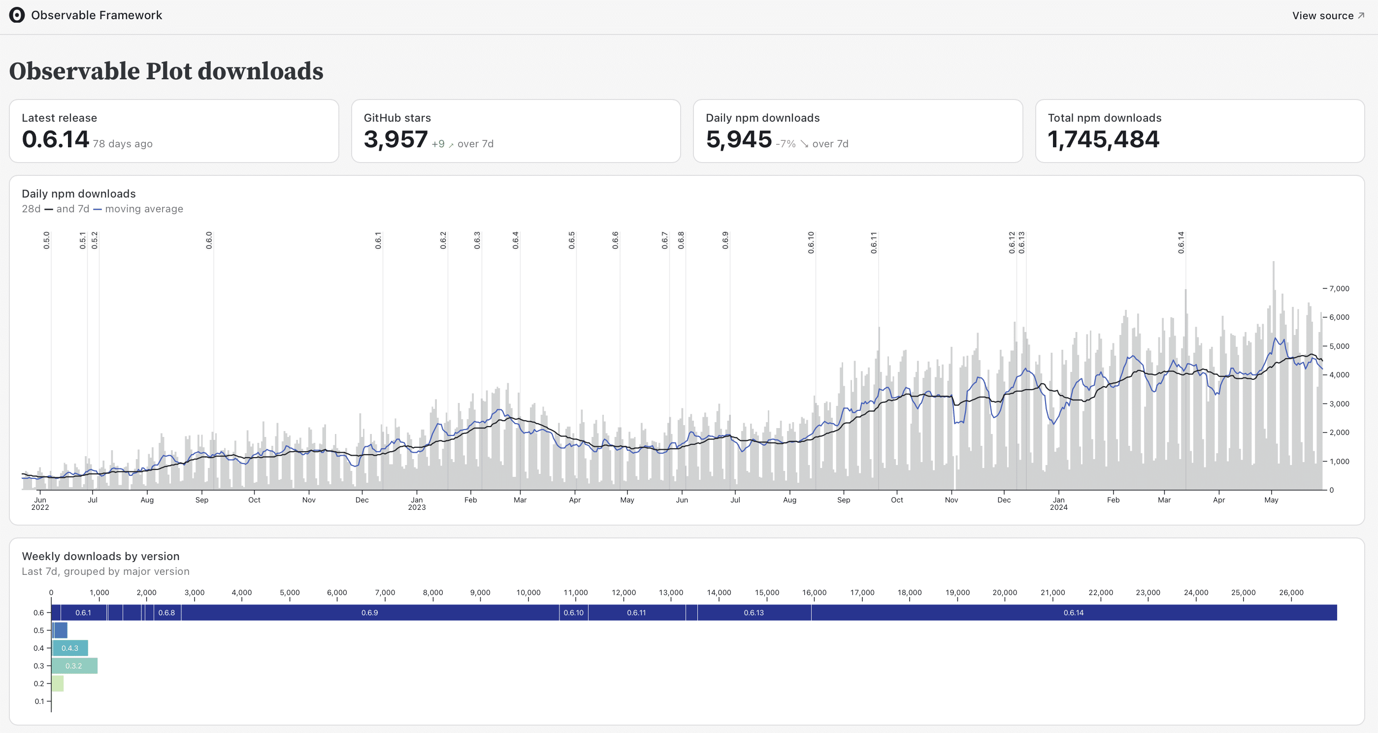
(Source: ObservableHQ)
Complete Flexibility: Customise every aspect of your visualisations, from design to interaction.
Diverse Applications: Build unique visual formats such as network graphs, interactive timelines, and geospatial maps.
New in 2025: Improved compatibility with modern web frameworks and expanded documentation for easier implementation.
Applications: Frequently used by researchers and developers, D3js powers academic visualisations and public-facing tools like COVID-19 tracking dashboards.
Pricing Model: Since it’s open source Javascript Library, it’s free to use but may incur costs when it comes to development and implementation.
Pro Tip: Pair D3.js frameworks like React or Angular to create responsive and scalable data visualisations.
D3.js emphasises design flexibility, but what if scalability and simplicity are your goals? Let’s explore Looker next.
5. Looker
Looker emphasises simplicity in creating modern business intelligence dashboards. Its compatibility with cloud-based platforms makes it a favourite for tech-savvy professionals focused on scalability.
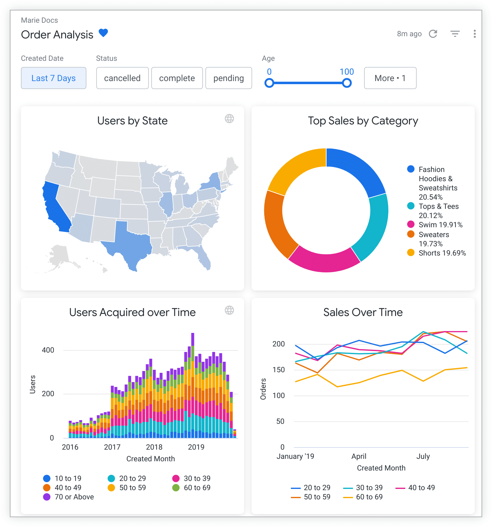
(Source: Cloud Google)
Cloud-Native: Seamlessly connect with cloud databases to access live data streams.
Custom Metrics: Define unique KPIs with LookML, tailoring analyses to specific business needs.
New in 2025: Enhanced mobile-first design options, ensuring dashboards are optimised for smartphones and tablets.
Application: In e-commerce, Looker helps businesses track customer behaviours to refine personalised recommendations.
Pricing Model: Looker Studio is free to use for creators and report viewers. For the enterprise level, Looker Studio Pro is currently priced at US$9 per project per month.
Pro Tip: Schedule automated report deliveries to ensure teams and stakeholders always have the most up-to-date insights.
Each of these tools brings unique strengths to the table, providing options for various needs and expertise levels. Now that we’ve covered the tools, let’s shift focus to the exciting trends shaping the future of data visualisation.
Emerging Trends in Data Visualisation
With tools like Tableau and Power BI setting the foundation for effective data visualisation, it’s equally important to stay updated on the trends shaping the future of this field. Here are the most prominent data visualisation trends in 2025 that are redefining how we interact with data:
1. Augmented Reality (AR) Visualisations
AR is adding a new dimension to data visualisation by allowing users to interact with data in three-dimensional spaces. Imagine walking through a 3D scatter plot or exploring network connections in an immersive environment.
Relevance: Professionals can use AR for presentations or training sessions, making complex datasets tangible and easier to comprehend.
Example: An engineering firm could use AR to visualise intricate project timelines or resources allocations in 3D.
2. AI-Driven Insights
Artificial Intelligence is transforming how visualisations are created and consumed. AI tools can automatically identify patterns in data, suggest the most appropriate visuals, and even generate insights without manual intervention.
Relevance: Analysts can save hours by using AI tools to automate data preparation and visualisation, focusing more on strategy and interpretation.
Example: Marketing teams can use AI to quickly identify trends in customer behaviour and optimise campaigns in real-time.
3. Real-Time Data Dashboards
The need for real-time decision-making has led to the rise of dashboards that update instantly with live data. These are particularly valuable in industries like finance, healthcare, and logistics, where timely insights are critical.
Relevance: Real-time dashboards empower professionals to act swiftly on critical insights, minimising risks and maximising opportunities.
Example: A hospital could monitor patient vitals and resource availability instantly, improving overall response times.
4. Personalised Visualisations
Tailored dashboards that adapt to individual users’ preferences and needs are becoming increasingly popular. These visualisations prioritise the most relevant metrics, ensuring users can focus on what matters most to them.
Relevance: Personalised Visualisations enhance user engagement, especially in collaborative environments like business intelligence tools.
Example: A sales team dashboard could display individual performance metrics alongside overall team goals.
5. Sustainability-Focused Visualisations
With an increasing emphasis on sustainability, visualisations are now incorporating environmental impact metrics.
Relevance: Businesses can track their carbon footprints or resource usage visually, aligning with sustainability goals.
Example: A manufacturing company might visualise energy consumption and identify areas for efficiency improvements.
With trends like these shaping the industry, let’s take a look at some recent real-world examples that highlight the power of effective data visualisation.
Real-World Examples of Recent Data Visualisations
To understand how data visualisation impacts decision-making and communication, let’s look at some exemplary visualisations making waves in recent years:
Example 1: Climate Change Impact Visualiser by Climate Central
Climate change is one of the most pressing global challenges. This interactive tool highlights how rising sea levels, temperature anomalies, and other climate impacts affect specific regions.
![]()
Global Warming Visualiser
- What It Does: The tool visually represents the global impacts of climate change, such as rising sea levels and temperature anomalies.
- How It’s Effective: The tool allows users to explore region-specific scenarios, providing a deeper understanding of the urgency of climate action. By visualising potential outcomes, it aids policymakers, educators, and the general public in making informed decisions about sustainability strategies.
- Key Features: Includes overlays and interactive maps to compare historical and projected data, making complex climate science accessible to a wide audience.
- Explore the visualisation here.
Example 2: Global Migration Patterns by UNHCR
Migration and displacement are critical issues impacting millions globally. This visualisation offers a detailed look at refugee movements and demographic trends.
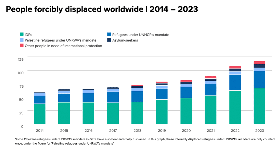
Movements and Demographic Trends
- What It Does: The tool visually tracks migration patterns across regions, highlighting key data points such as countries of origin, transit, and destination.
- How It’s Effective: By aggregating data into a visually digestible format, it helps humanitarian organisations, policymakers, and researchers understand migration flows and allocate resources effectively.
- Key Features: Interactive filters allow users to drill down into specific regions or timeframes for deeper insights.
- Explore the visualisation here.
Example 3: US Election Dynamics Visualisation by FiveThirtyEight
Elections are dynamic and complex events that influence significant policy and leadership decisions. FiveThirthyEight’s visualisation simplifies this complexity through interactive tools.
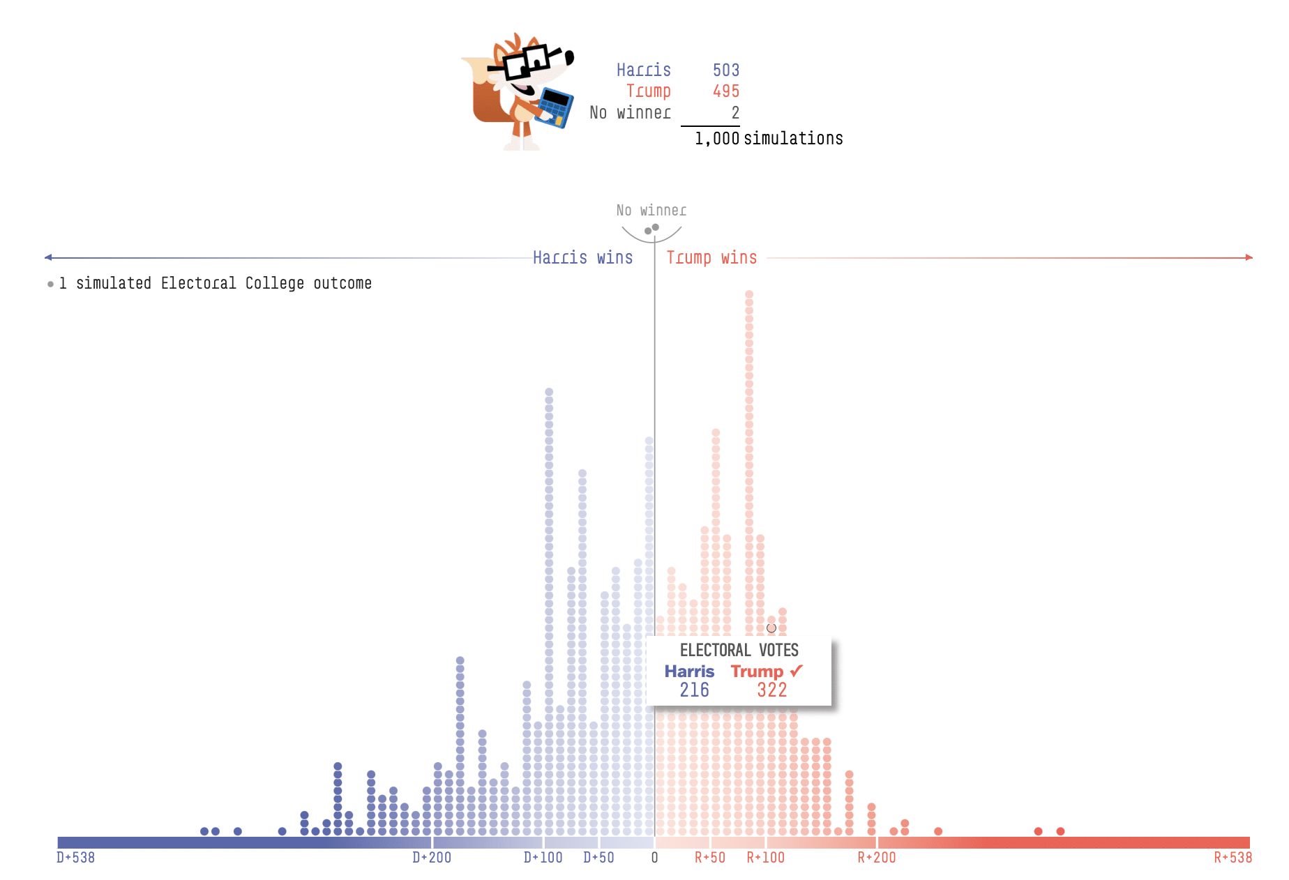
Electoral Vote Prediction Margin
- What It Does: Tracks and forecasts election results by combining polling data, historical trends, and statistical modelling.
- How It’s Effective: Provides a clear, interactive way for the public, analysts, and media to understand and predict election outcomes. The data-driven approach helps audiences navigate the uncertainty of elections and form well-informed opinions.
- Key Features: Dynamic charts, scenario-based modelling, and colour-coded maps that adjust in real-time as new data is inputted.
- Explore the visualisation here.
These examples highlight the power of data visualisation to distil complexity into actionable insights. Whether addressing climate change, migration crises, or political forecasting, these tools demonstrate how effective visualisations can transform understanding and drive decision-making.
Wrapping Up
Mastering the art of data visualisation is no longer optional – it’s essential for professionals in every industry. Whether you’re a seasoned analyst or a beginner exploring data for the first time, understanding the right tools and techniques can make your visualisations impactful and engaging.
In 2025, tools like Tableau, Power BI, Qlik Sense, D3.js and Looker provide unparalleled capabilities for creating impactful visualisations, while trends like AI-driven insights and AR visualisations continue to reshape the field.
Key takeaways from this article include:
- Leveraging tools like Tableau for intuitive dashboards and storytelling.
- Using Power BI for seamless integration and real-time analytics.
- Exploring trends like personalised visualisations to tailor data insights.
Experiment with these tools, stay updated with trends, and don’t hesitate to seek out resources like online tutorials and forums to refine your skills. The power to transform data into actionable insights lies at your fingertips—use it to make a difference!
Want to Learn More?
If you’re ready to elevate your data visualisation skills, explore how @ASK Training can help you refine your skills, designed for professionals at every level:
- Data Visualisation and Storytelling with Power BI: Master the ability to create compelling and actionable dashboards within the Microsoft ecosystem.
- Data Visualisation and Storytelling with Tableau: Unlock the full potential of Tableau for creating visually engaging and data-rich narratives.
Transform the way you communicate data insights and get in touch with us today!
Related Courses
- Data Visualisation and Storytelling with Tableau
- Data Visualisation and Storytelling with Power BI
- Bridging Big Data Analytics using Excel & Power BI
◆◆◆